Author: Jonah
Prototype Plan
Idea 1: The Doorbell Button
Consider the setting:
The button is best suited to the home environment, placed in locations which tie closely into activities which require cueing or which would benefit from tracking. Some examples include the bathroom sink for a prescription reminder button, the kitchen counter for an eating reminder button, or the front door for an outdoor exercise button. This device will serve a dual purpose as a cue to remind the elderly person to conduct the activity they need to be doing as well as notifying their loved ones and care providers that they are taking care of themselves, thus building confidence in their ability to live independently.
Define how to test:
The best way to test the viability of the doorbell button at this stage (pre-digital platform) is to attempt to habituate an elderly person to pressing an analog button in an optimal location. Simply asking a subject to press the button every time they complete a task will provide information on the ease of use and reliability of pressing the button. We will learn if it is reasonable to depend on the elderly to press the button when they complete independent living activities or if there needs to be other methods of cueing behaviors such as auditory cues or physical reminders.
How to conduct feedback:
Feedback from elderly subjects will provide valuable insight as to the utility of the button for cueing simple tasks and notifying caregivers of the status of their loved ones or patients. Asking the subjects for their opinions on using the button, how reliably they used it during the test period, how often they thought about the button, and how easy it was to determine a location for the button are all questions that would deliver value to our prototype design.
Idea 2: The Dashboard
Consider the setting:
The dashboard is meant to be mounted to a wall at a convenient location in the elderly user’s home. Ideally, it would be positioned in a bedroom, kitchen, or any other room that the user often occupies. The dashboard will be an all-in-one platform that displays all of the user’s vital health statistics and sends this information in the form of a daily newsletter to the user’s family and doctors. It can also send instant notifications to the user’s loved ones in case of an emergency situation. The dashboard can be linked to other products in our proposed technological ecosystem or exist on its own, but works most effectively when connected to the button and wristband.
Define how to test:
There are a few ways that we can test the viability of this product. We will try to habituate an elderly person with a tablet device and observe how comfortable they are using it. We will also make a mock-up screen interface displaying sample sections of the dashboard, and show this prototype to both elderly users and medical professionals to gauge the importance of different metrics tracked by the dashboard.
How to conduct feedback:
We will collect feedback both from elderly patients and medical professionals in order to measure the comfortability that users have with our product and the relevance of what we plan to track on the dashboard. Elderly professionals will provide us insight on how comfortable they are using tablet technology, and will also tell us what metrics they find useful to track. We will also receive feedback from medical professionals about what vital statistics they consider important to monitor in their elderly patients. We will use this information to build an ideal dashboard that is both easy to use and a provider of essential, relevant information.
Idea 3: The Bracelet
Consider the Setting:
The bracelet is a multifunctional, easy-to-use accessory that provides peace of mind when the user is in their home or out on the town. It is meant to go beyond the capabilities of a typical fitness-tracking device, and complete the Optum Ecosystem as the wearable component. It would be able to track the same vital health statistics as the Dashboard, in addition to physical activity metrics. However, the capability that separates the Optum wristband from other products is its ability to detect falls and immediately notify your loves ones and healthcare professionals. Falls account for billions of dollars of costs each year, and undetected falls can lead to death. We plan to mitigate this issue with our wristband.
Define how to test:
In order to test this product, we plan on providing a post-retiree with some kind of smart wearable device (FitBit, Apple Watch) and observing their activity levels (if there is any change) and if they upload their daily activity. Since we don’t want anyone falling, we can test how easy it is to ask Siri or Alexa to place a call to a loved one to simulate that same act if it were in an emergency situation.
How to conduct feedback:
We recognize that providing a wearable device to a generation that may be generally unfamiliar with the product may be an obstacle. Also, when it comes to wearing anything, people tend to be picky. In addition to the features and ease of use, we would need to request feedback about how the product should look. We can fill out a survey asking them questions about their activity and also leave room for open-ended comments.
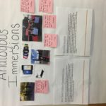
Analogous Immersion
For my analogous immersion, I used data obtained from my weekly volunteer assignment at Walt Disney Elementary school in Mishawaka, IN. Through the Student Welfare and Development Program of Notre Dame Athletics, I lead a small reading group of 3rd grade students at a local elementary school for one hour every week with the goal of fostering strong interest and development in learning.

Interactive Ethnography: Card Sort
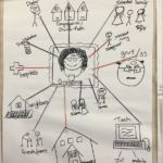
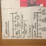
For my interactive ethnography, I asked 53 year-old Paul Leslie and 50 year-old Robin Levine to conduct a “card sort” to identify their preferences in health and knowledge of technology.
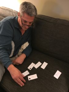
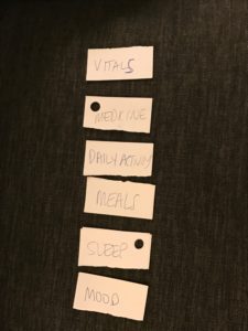
Based on these results, we are able to tell what kind of user Paul might be. He is someone who is not as concerned about his mood or sleep (which might explain his negative attitude at times) as he is about his vitals, medicine, and daily activity levels. An ideal product for Paul would have the capability of tracking crucial health metrics (such as heart rate, blood pressure, etc.), when he needs to take his medicine, and how many miles he’s walked (or other FitBit related data).
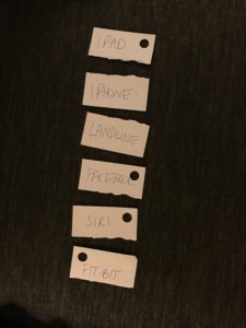
According to these results, we can assume that someone like Paul values a device that has a large, engagement-compatible screen with high functionality. Further, he isn’t quite ready to give up the feeling of being able to physically call someone to initiate contact (landline over Facebook). Lastly, he rarely uses Siri and does not own a FitBit.
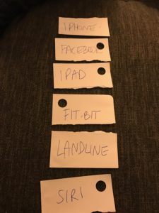
Robin is more willing to try new things, and naturally more technologically gifted, than Paul. Her results suggest that she may be willing to try a new product, and let go of archaic forms of technology in favor of more innovative ones. However, she does not feel the need to utilize Siri, or some other kind of voice-assistant, because she is perfectly capable of engaging with all the features of a smart device on her own.
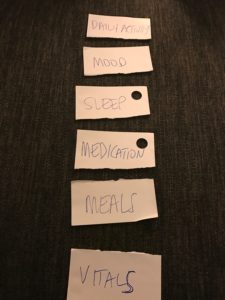
Robin fits the profile of an “active Arnold” since she is more concerned with how she seems to be “feeling” than how her body is technically functioning. She knows what she needs to do each day to put her best foot forward, and while she is indeed healthy overall, she cares less about technical health statistics and more about the natural processes of living. An ideal product for Robin would be able to track her fitness output, hours and quality of sleep, and general mood.

Lastly, here are Leo’s preferences for living a happy and healthy life! (Note: Leo’s input will not be included in our data, nor considered in the design of our finished product).
Breakfast Date with Pat
We were lucky to finally meet our client and mentor, Pat Keran, for breakfast at the Mendoza Cafe on March 29th. In our discussion with him, we readdressed our research and introduced him to our initial ideation ideas. We talked about buttons, wearables, platforms, analytics, statistics, and more. He provided fantastic feedback and helped keep us on track for what he is looking for, while also fostering inspiration by encouraging creativity. We addressed several key questions, such as: What about use outside of the home? How do we connect the prototype to work remotely? How about a wearable vibrating device for reminders and detecting falls? And will insurance companies subsidize the costs? Wendy also proposed a great idea inspired by United Way, which is a master dashboard check list of sorts that displays a progress bar towards “optimal health”.
- keep the product simple (integrate it into an ecosystem of standard things at home)
- make sure it is engaging (Game-ification and socialization are huge)
- make is customizable to fit the needs of as many people as possible
We look forward to ideating and prototyping with these thoughts in mind!
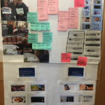
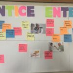
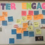
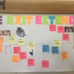
Gallery Day Summary
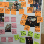
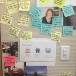
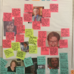
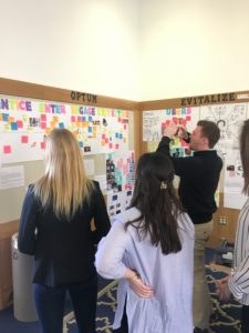
I believe Gallery Day was a fantastic success for Optum Team A. Initially, we weren’t sure how much information we really had, but once we laid everything out and organized it in the UNI framework, the trajectory of our project became clearer, and it was comforting to see our extensive research come to life. Though we needed to connect with Pat remotely to show him our work, he was able to provide great recommendations and insight over FaceTime. He kept us focused on the financial viability of our potential prototype, which enabled us to brainstorm with constraints in mind. Our slap stats kept us focused on the various way our prototype could decrease healthcare costs. And lastly, seeing our users and their concerns “in person” reminded us to see things from their POV (empathetically). All in all, Gallery Day was an insightful, motivating, and comforting experience for our team.
Immersion Summary – Jonah, Rob, Therese, Mary, and Sophie
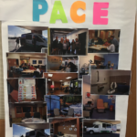
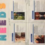
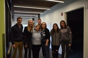
On Friday, March 3rd, Optum Team A experienced an incredibly valuable immersion at St. Joseph PACE in Mishawaka, IN. The PACE center is a nonprofit affiliated with Trinity Health whose mission is to keep the elderly “safe and healthy at home.” They identify the elderly in need and offer an affordable, accessible, engaging experience for those are determined “fit” for PACE. PACE offers a holistic and proactive approach, a “one-stop shop” if you will, that provides all the necessary factors to aging in place: doctors, physical and mental therapy, dietitians, activities, transportation, and more, all on-site. They tailor the plan to the individual accelerate recovery, prolong life, and enhance their service. The site itself looks a futuristic daycare, with spacious rooms, comfortable chairs, showers, a kitchen, Xbox, workout facility, fully equipped rooms for doctors and nurses, a non-denominational religious room for worship, and more.
While on site, we were lucky to have a guided tour and 90 minute interview with three experts: Bobbi Costigan, head nurse; Kathleen Murphy, CMO; and Ashley Stump, intake coordinator. In addition to key details about their service, they provided insightful information with regard to the user and the future of the business.
Here are the 3 key takeaways our team garnered from the visit:
- PACE-like centers reduce the cost of hospitals in their community
- can we replicate this in a product or service?
- What key health metrics to look for
- vitals, falls, supplement intake, etc.
- The importance of a one-stop shop, easily accessible and customizable health care plan
Workaround Opportunities
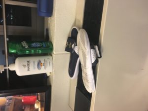
I use my AC/Heat unit to dry my shower shoes in between uses!
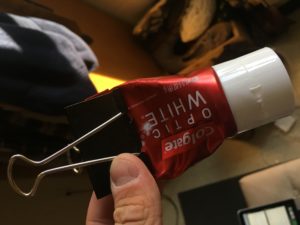
Here, I use a binder clip to squeeze all of the paste from this overpriced tube of toothpaste that I purchased from the huddle.

This is a bit more abstract – my roommate and I used the modular furniture in Keough differently to create a multipurpose desk and closet with extra storage on top. Normal set up is to the right… my setup is the one that is delofted. Feels more spacious, believe it or not!
