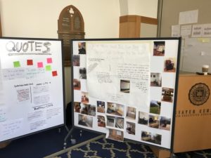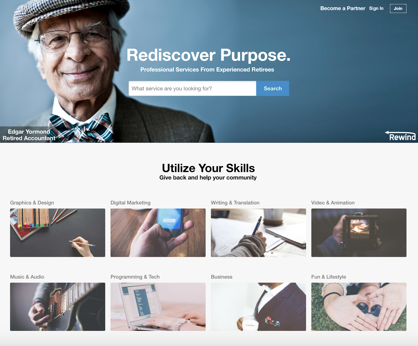
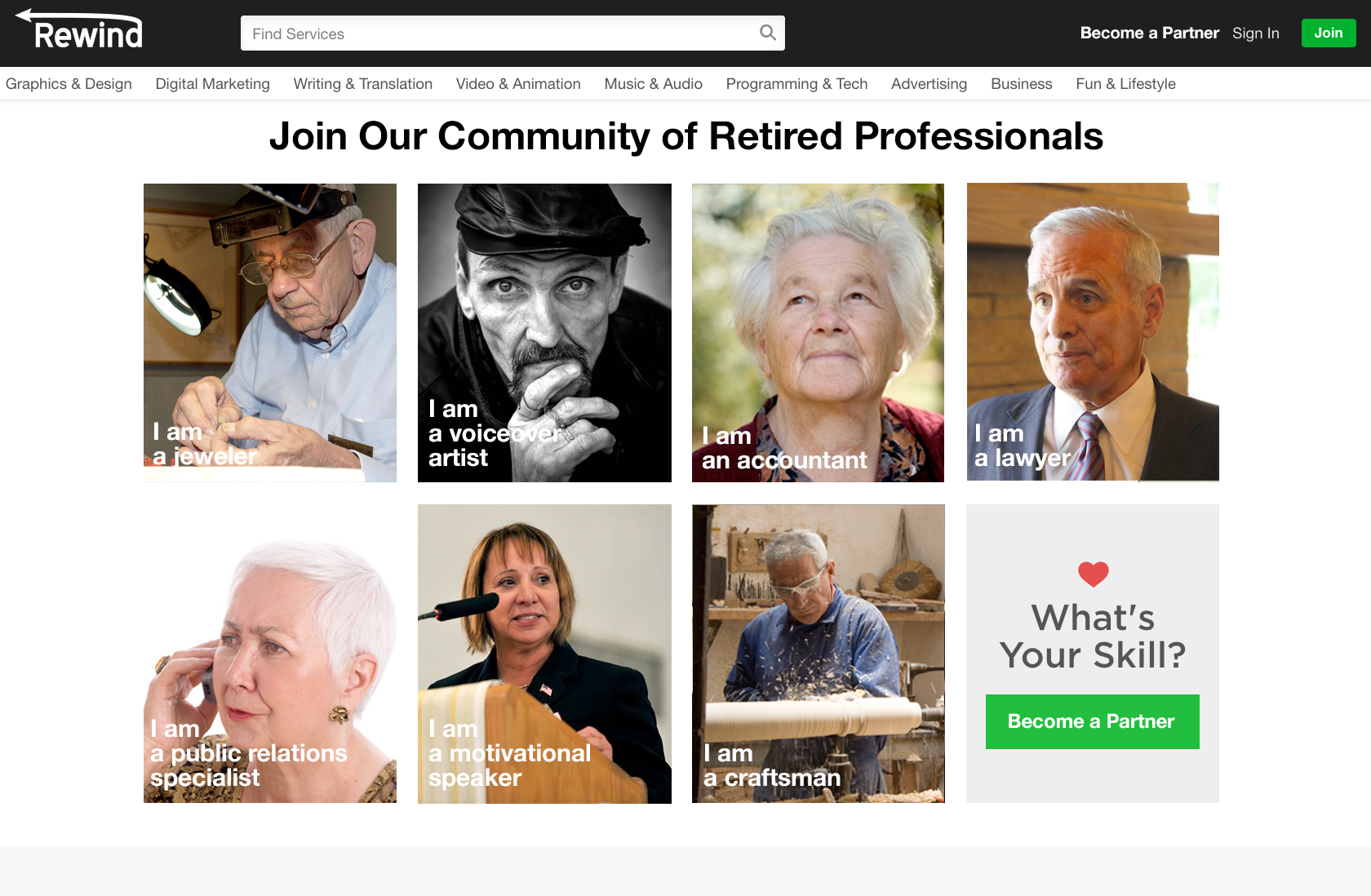


In the prototyping stages, we waited for Pat’s input on our ideation summary to begin testing. Since Pat basically eliminated two of our ideas from possibility, we were able to focus our testing on the job board website. The group created some iPhone screen mock-ups for users to examine. Even though the main channel will be a typical computer with internet access, the iPhone screens gave us the opportunity to accentuate the main ideas of the job board. After visiting the Saint Joseph PACE Center and speaking with team family members, the group acquired some valuable feedback. Retiree Gayle Books, a former KFC employee and PACE participant, stated “I need a buddy like you there” while I was explaining who the users would meet up with to complete tasks. This pointed to a major oversight in the prototype: we had only allowed one user to help another single user. Adding options to combine the expertise of multiple users to tackle problems made sense in that complicated jobs could now be easier to complete and teamwork would lead to more social connectivity amongst users. One of the main things Professor Angst stressed is the E for Enticing, so the group tested which incentives were most coveted. Desired rewards seemed to fluctuate randomly. Cash rewards reigned supreme in the end, especially according to individuals with lower retirement savings. Thus, the job board should have an option for a cash reward on each posting. Lastly, ideally local stores and companies would be involved by offering discounts to products/services related to areas of expertise. PACE Activity Director Joe Collins pointed out the missed opportunities from these local stores possibly posting simple jobs, or even workshops, onto the job board. This would allow stores to get cheap, or even volunteer, labor while also increasing a sense of community for the users. Also, beginner style workshops could excite the users to develop skills in the hobbies they want to pursue.
Key Takeaways:
iPhone Mock-up Pictures:
In the second call with our client Pat Karen on Tuesday, April 25, we proposed our three product ideas in the form of our ideation summary. We went into the call believing our smartwatch was the best idea and an idea that could incorporate the other applications into it, but Pat almost immediately shot it down due to the intense popularity and established competitors in the market (Apple Watch, Fitbit). He did admire the need for the physician to prescribe the watch since the older population is resistant to commands. Our second idea, the schedule, was too close to a service like Google calendars, and Pat believed that it would not meet the needs of our target user. He had little more to say about the schedule, so we all though the phone call was a train-wreck. Fortunately, the online job board/job sharing service intrigued Pat the most. This surprised the group initially, but after talking it over it made sense to pivot away from the watch. He agreed with us that the product could fulfill the social needs of the user while also providing constant engagement, both physical and mental. Our initial worry was that the job board would only be accessible through internet friendly devices such as tablets and laptops that may not be easy to get a hold of, but Pat insisted that the job board should be available through all internet platforms. This phone call gave us a clear product choice from the client’s perspective to focus on.
Key Takeways:
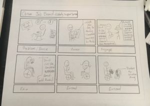
Product: Optumal Jobs
Problem: Retirees desire to stay in their home as long as possible, but this can become a lonely life without a spouse. Loneliness leads to mental illnesses such as depression, which can accelerate the deterioration of the body and ultimately force the user to need care outside of the home. Also, users struggle to find a purpose during retirement and often miss doing what they love and know.
Entice: Retirees will be able to volunteer to complete simple jobs in their area of expertise in return for jobs that they are not capable of completing. In addition, a tier system will rank and track the amount of jobs users have completed in order to distribute other rewards such as insurance benefits and coupons to local stores related to the users’ favorite jobs.
Enter: They can use their previous skills to sign up on a job board. Accessing the service through the website, users can create an account in order to earn rewards/points or complete small tasks as a guest. On the website, the user can browse for jobs that fit their expertise.
Engage: Retirees will be able to ask for tasks to be completed and complete tasks of their own that correspond to their area of expertise. This area of expertise most likely will be related to their former job, but it can also be a new hobby the user has picked up.
Exit: Once the user has completed/ shared as many tasks as they please, one can stop using the website whenever they please. The rewards, a sense of community, and a purposeful life should keep the user inside of the house for as long as possible.
Extend: The customized account will be on the internet for others to admire, and the experience and rewards the users may have earned should help the retirees pursue their hobbies.
http://www.cnbc.com/2017/04/18/alphabet-health-tech-influence-silicon-valley.html
To be sure you get meaningful feedback, go deeper on the ideas. What is the need you are addressing for the individual? A feeling of control? Peace of mind? Connectivity? How do your ideas propose to meet these needs for individuals? You want to test how you meet the need, and less of a focus on the actual thing. How can you invite interaction and discussion with your user base? And keep in mind as you begin capturing prototype feedback that just like with your ethnographic research, you will want to capture video, photos, and direct quotes.
For the 5E’s, remember for each idea how your user is “enticed”. This is a big hurdle of how you will compel participation. Implementation of ideas is always the toughest part!
This may be a good forum for exchanging ideas: https://challenges.openideo.com/challenge/fall-prevention/ideas?utm_medium=email&utm_source=mailchimp&utm_campaign=fall+ideas+page
Before immersing ourselves in Wood Ridge Assisted Living, I contacted Angela in order to setup a graffiti wall a week in advance. She suggested that we place the graffiti wall in the employee break room. Our question, aimed towards the caregivers, was, “What advice would you give your younger self to prepare for becoming a caregiver?” After a week, 7 people responded to the question. While this was not the turnout we were looking for, Connor and I gathered some details about caregivers, one of the pivotal stakeholders of our project.
Key Takeways:
