Last class we talked about how one might design a digital edition of King Lear that doesn’t prioritize one version of the text above the other, that is readable as each individual version of the play, and that allows you to see variants when they occur. I think it’s theoretically impossible to get an edition of multiple witnesses of the text that does not even in the slightest privilege one version above another–one edition conceptually has to get put first, whether it’s the first listing in a drop-down menu of which version you’d like to look at, the first discussed in the introduction, or the default version to pop up when you click to look at the play. I think that no matter the attempt one makes to emphasize all the versions of the text equally, whatever the first option in that drop down list happens to be is still probably going to get more traffic than the other options. That said, I do think that there are some design practices that might minimize the prioritization of one edition over another. First of all, I think that a digital edition would need separate texts of each version that viewers could access independently of the others. They could hyperlink to each other at points of textual variance, but you’d need equally robust editions of each text of the play to create an unbiased edition. You could maybe even create a separate edition that acts somewhat like the one Arnaud had described in class–one where there are hyperlinks to look at alternate forms in other manuscripts.
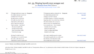
I would probably handle footnotes or links to other recensions in an edition of King Lear similarly to how Susannah Fein’s online edition of the Harley 2253 manuscript handles footnotes. The footnotes are present and scrollable in a bar at the bottom of the page (I’ve linked to it here so that you can play around with it, because it’s difficult to see how it works from only a screenshot). There are hyperlinks in the text to any points of interest in the footnotes, and clicking on any of those hyperlinks takes you to the relevant point in the footnote bar, but leaves the main text where it’s at so that you can see them in parallel with each other:

Moreover, you can pull the footnote bar to wherever you like on the screen–the footnotes can take up most of the screen, or can be pulled out of the way if all you’re interested in is looking at the text. But I rather like this way of handling footnotes because it keeps the footnotes easily accessible at every point in your reading, doesn’t take you away from the main text when you click a footnote hyperlink, and you can choose how much of the screen you’d like it to take up. I think that for a project like the editing of King Lear, it’d be nice to have a multipurpose footnote bar–you could set it to show different things–the band of death, critical commentary on the passages, textual variants in other recensions, or even other witnesses of the same recension.
