I’m updating this previous post with the sad news that David Blodgett died on Friday; you can read a brief obituary here. I wrote below that “David Blodgett is probably the lone living keeper of the logo story,” and that particular chapter has now definitively ended. But I closed the original post by noting that the truth behind the BOC logo’s design is more about satisfying curiosity than confirming essential facts anyway. And Beyond Our Control company member Ron Bryan, who was in the group over a decade after Blodgett left, captured the most essential fact about Blodgett’s artistic achievement with this comment: “It’s fair to say his arrow runs through the heart of every one of us in the Beyond Our Control sphere.”
Originally posted on June 4, 2024
Accuracy of memory is a significant challenge in historical research projects, especially those heavily reliant on oral history. Interview subjects might forget details, alter their perspectives, or either romanticize or vilify the past over time. This is why I’m driven to do as many Beyond Our Control participant interviews as I can. I’m asking people to recall memories from up to sixty years ago when their brains were literally still developing, and hearing similar memories from different people can help crystallize truths. There are also some key people that I’m unable to talk to, so I need help to fill in as many of those gaps in the record as I can. (If there are any Michiana mediums out there reading this, hit me up!) Last week, I met with my 98th interview subject, David Blodgett. He’s a local legend in multiple ways, partly as a prolific mural and caricature artist (see links below), but more to the immediate point, he’s forever inscribed in BOC lore as the designer of the magnificent logo:
Nearly everything in BOC was done in groups, enabling me to consult with multiple people to confirm accurate recollections. But David Blodgett is probably the lone living keeper of the logo story.
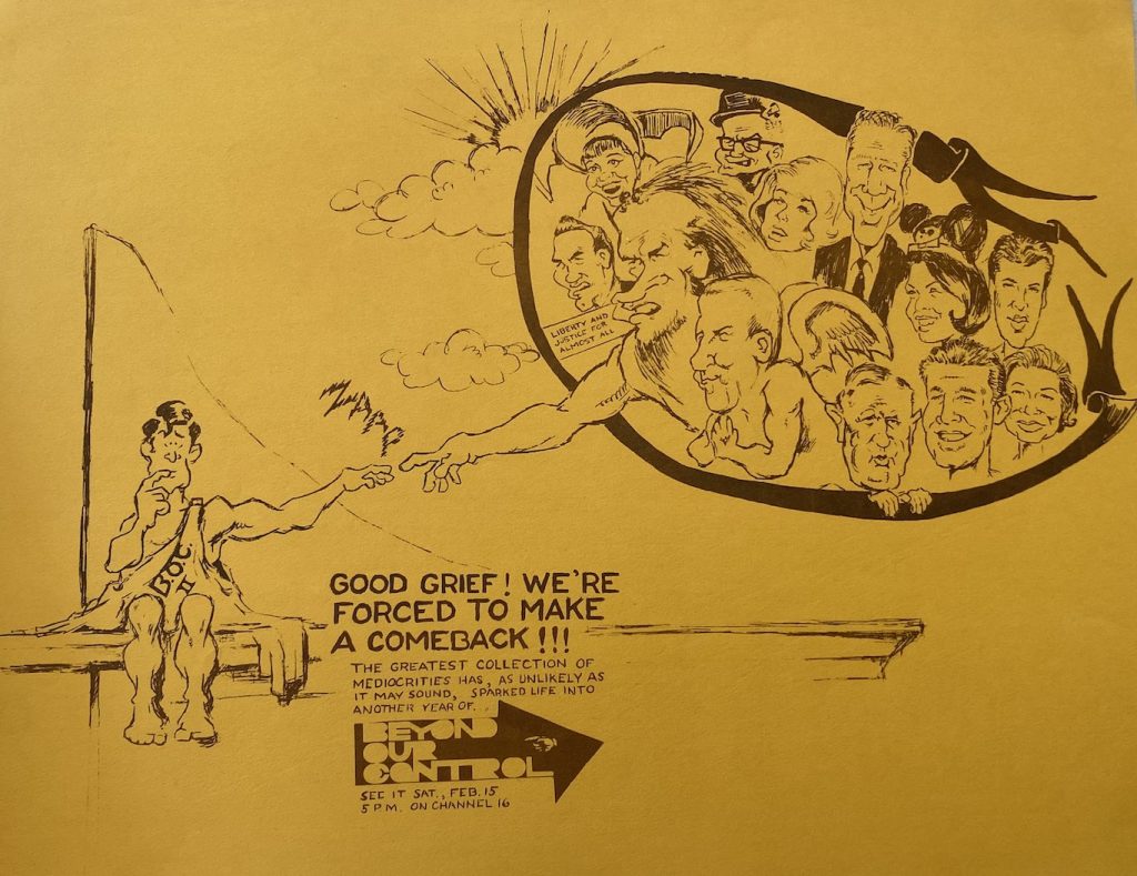
He became a company member right as BOC was being formulated in 1967 and was already a budding artist as a teenager. He recounted to me that he especially enjoyed drawing faces, admired 19th Century advertising artwork, and lugged a big book about Rembrandt around in high school, telling teachers it was his “serious study,” as opposed to the topics they were proffering. In a 2001 collection of testimonials put together for BOC’s first big all-company reunion – fittingly referred to as the Memorybook – he’s quoted as saying, “The guys asked somebody to design a logo, and I said, ‘Designing things, that’s my alley,’ so I said, ‘I’ll do it!’” And we don’t need to rely on anyone’s memory to assure us that he was exceptionally talented in that alley of designing things, because we have archival proof of it. Just check out his artwork to celebrate the start of BOC’s second season, drawn when he would have been maybe 17 or 18:
But getting back to the logo, in the Memorybook, Blodgett says that the distinctive hand and arrow were inspired by a graphic he saw while leafing through Mad magazine, and then he refined it while working a summer job at his father’s advertising studio. For instance, his dad, a commercial artist at the studio, recommended reversing it from black letters on a white background. However, today Blodgett says the Mad detail in that story wasn’t true. Here’s the origin story for the logo he relayed to me last week:
[W]e had to have some sort of identity, so we had to figure out some sort of logo. My father was a commercial artist and worked for Borkowski Advertising, which is old… was a little company, and I worked for Bob Borkowski in the summertime. So I went down, and I was about to figure out what the heck this logo was gonna look like. So I just lettered up ‘Beyond Our Control’ in some sort of way. And I did know that I wanted a hand pointing toward the wording…I was particularly enamored of 19th century advertising. So that’s where that came from. And I was going to do the lettering in sort of 19th century style. And I was working, and I didn’t really like that. One of my dad’s colleagues was a guy named Ken Krempec, and Ken came over and looked at me and he said…and I had all kinds of scrolly, rolly stuff around it as a border. And he said, ‘now, I don’t know, Dave, the hand’s okay…get rid of the scroll stuff. We don’t need that.’ I says, ‘Okay. What would you want me to do, Mr. Krempec?’ So he sat down, and he drew an arrow around the name and the little hand. And I said, ‘Oh, that’s fun.’
I immediately asked for clarification that Mad was in fact not part of the design inspiration for the logo, and he confirmed that. After then heading home and double-checking the Memorybook testimonial, I sent a follow-up question through his sister Marcia (herself a 1970-71 company member), who replied to me after asking him about this: “He was flummoxed about his [Memorybook] response. We decided that possibly he didn’t want everyone to know about its real origin and just relied on his favorite magazine.” It’s also the case that David admitted during our conversation that remembering all of this accurately was hard: “You know, I’m old, and heck, I don’t remember what the heck I had for dinner last night,” he said. Again, understandable!
So where does that leave me in trying to pin down the real story about where the logo comes from for the book? The Mad origin story would be fun because it’s a frequent comparison for BOC; after all, TV Guide dubbed the series “the Mad Magazine of the Air” in its 1973 profile. But then again, Dave Williams always told the students to strive for originality and not to imitate sources like Mad. Given that, I am more partial to Blodgett’s current memory of the logo genesis, that a random ad man popped his head in and offered the youth an insightful suggestion for a cleaner, more modern design. Beyond Our Control was all about incisively cutting to the heart of the advertising world, so that’s a very fitting creation myth. I should also note that we can’t even really be certain about who contributed the arrow idea. I had trouble finding definitive info on a Ken Krempec at the agency; BOCer Lynn Crowell brought my attention to an obituary for a Roman Krempec, who was a photographer at the agency, and Roman’s 1976 obituary mentions a surviving stepbrother Kenneth, but he doesn’t seem to have an online footprint. Maybe it was Roman, maybe it was Kenneth, or maybe David was misremembering the whole thing.
Ultimately, the specific minutiae are not crucial in this case anyway. It’s more a matter of satisfying curiosity than proving essential facts. The fundamental truth is that David Blodgett lent his prodigious, precocious artistic talents to Beyond Our Control and designed its iconic logo. From there, it’s just haggling over the details.
*Links to info about David Blodgett’s local murals:
A Backdrop to Michiana Life murals by David Blodgett
South Bend Restaurant Gets Fiesta of Color
A mural honors Riley High School’s past and present
Wildcats’ history depicted in new mural about Riley High School

