In a series of studies we have investigated navigation problems in a conference center in Günne/ Lake Möhne, Germany. Hölscher, Brosamle, & Vrachliotis (2012) provide a detailed space syntax analysis of this setting and introduce several new measures to capture wayfinding behavior in a Space Syntax approach. Here we illustrate various depictions of the building, provide a movie clip of a tour through a virtual version of the building, and provide comments by architects and users. The architect comments were derived from a series of interviews with experienced architectural practitioners in Germany and the United Kingdom. The conference center was used in a case study in these interviews. The user comments were collected after visitors of the conference center participated in a wayfinding study. For a more detailed description please refer to Hölscher, C.; Brösamle, M., & Vrachliotis, G (2012). Challenges in multilevel wayfinding: A case study with the space syntax technique. Environment and Planning B: Planning and Design, 39, 63-82. (article available upon request from the lead author: Christoph Hölscher)
Images of the building
The Heinrich-Lübke-Haus in Günne/ Lake Möhne, Germany.
Outside view of Virtual building model.
Navigation in Buildings
Click here for a movie clip of navigation through the virtual building
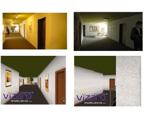
Screen shots of physical and virtual building.
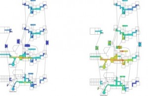
Representations of Building Structure
Space Syntax analysis of the overall corridor network. Local connectivity is depicted in the left-hand panel, the centrality measure “integration” is depicted in the right hand panel. While the main corridor on the entrance level is well integrated, other important areas appear to be largely segregated. The overall intelligibility score is rather low ( r=.15). Specific problems of the building are discussed below.
(Note: The analysis illustrated here used VGA- Visibility Graph Analysis, a variant of Space Syntax analysis based on isovists (directly visible floor space) rather than axial lines).
Architect comments:
- I think this is a complex one. This probably would be very confusing to go around.
- There’s no obvious way you’re suppose to walk to… because that’s all similar
- I would question why on earth have they done that?
- you can get lost
- They’ve clearly planned the functional spaces to the detriment of the circulation spaces.
User comments:
- This building is really difficult for me
- Too many angles, not enough parallel corridors, the orientation changes rapidly, confusing when I try to get to another room.
- Although the floors are roughly above each other, they seem to be offset and different from each other. Problematic.
- This building is terrible, very rambling and pretty labyrinthine.


