Like Arnaud, I am reading King Lear out of David Bevington’s The Necessary Shakespeare. Bevington’s edition is a student edition, and accordingly most of the footnotes are simple glosses to the text or paraphrases of difficult passages. However, Bevington also consistently provides footnotes indicating the current location of the action of the scene, which I found interesting since they at once seem to offer extensive editorial interpretation of where the scene takes place, and divide even the notes to the text into scenes, even as the fact that these occur in the footnotes shows a desire to make these interpretations of location seem clearly editorial rather than authorial. I’ve chosen the page below, the beginning of act 4 scene 5, both because its footnotes are interesting and because it provides a good cross-section of the kinds of footnotes in the volume:
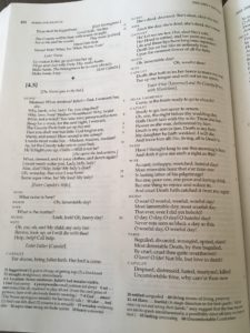
In the above picture, the note to 4.5 states that the scene continues, and Juliet’s bed remains visible. Although some of these location notes are hardly debatable–the note about Juliet’s bed makes sense given the text of the play here, the running interpretation of location clearly isn’t a feature of the original folio and quarto texts, and provides a tacit editorial intervention and interpretation of the scene change.
The location notes are also interesting on a visual level. Bevington formats his notes so that glossed words appear in bold while their definitions appear in regular font. Any comments lending historical context tend to appear in parentheses, and Bevington provides very loose paraphrases of particularly complex passages after “i.e.,” thereby distinguishing his paraphrases from exact translations of the Early Modern English text. Aside from the words excerpted from the text, which are bolded at the beginning of each footnote, all the notes are in regular typeface at roughly 8pt font. The location commentary at scene changes, however, is bolded in its entirety, subdividing even the notes into scenes. This admittedly isn’t as much an interpretive decision as a design choice, however, it’s one that emphasizes the scene changes more than other editions do even if only in the notes.
The emphasis of the edition on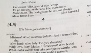 scene beginnings is interesting in conjunction with the way Bevington formats scene beginnings in the main body of the text. Although Bevington’s edition has text in each of the three lines of print dividing scene four from scene 5, the scene number is in a large font, making these three lines take up space equivalent to sic regular lines of the play. Accordingly, these three lines of print leave substantial negative space between scenes, accentuating the division between them. The small clover-shaped flourish at the end of scene four and the bold typeface for the scene number heighten this division. However, both the scene numbers and stage directions are offset with square brackets, which at once make it explicit that these additions are editorial interventions and perhaps also add a visual sense of uncertainty–although these are the traditional scene divisions, they’re tentatively put forward as the result of editorial tradition rather than words from Shakespeare’s pen. Like the location notes, the formatting of the scene change is at once designed to provide a clear division between the scenes, and to show that these subdivisions of the text and editorial interventions may not have been available to a contemporary reader of the play.