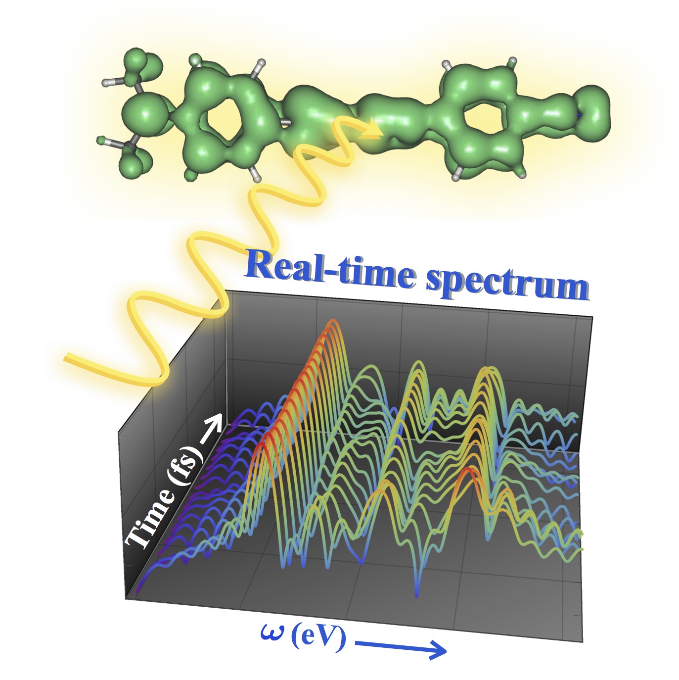
The best part about this blog is we can post attractive but unconventional scientific stuff. This is a lovely “table-of-contents” style graphic that Triet has made about our recently developed realtime dynamics code. It nicely sums up our efforts in this area. The data is real too.

What software was used to generate this attractive figure?
A combination of gabedit and Mathematica