Overview
- Time: 1 hour (5 introduction, 20 teaching, 30 activity, 5 wrap-up)
- Objectives:
- Learn the importance and impact of data visualization
- Learn important forms of data visualization and considerations that should be taken into account
- Practice using TableauPublic to visualize sample data
Introduction
Data is meaningful, insightful, and persuasive. Albeit, with data manifesting in many forms and sizes, it can also be complex. Data visualization is your key to bridge the gap between the information and the conclusions you wish to make. With the techniques presented below, you will be able to show what you wish to convey in data such as relationships, patterns, and important factors. These techniques are powerful for individuals who wish to more easily communicate insights. One such purpose may be for gaining proof of funding by showing progress of the organization over time in reaching its mission.
Data Visualization Techniques and Examples
Consider a few powerful examples of data visualization below. As you or your cohort look through the examples, consider or talk to your partners about what techniques each one uses to convey data in a quick and effective way. For interactive examples, open the link provided and play around with the user interface provided.
Here are a few helpful factors to consider when looking at the examples:
- Interface
- Shapes
- Colors
- Symbols/Icons
- Labels, Titles, and Headings
- Descriptions
- Interactivity
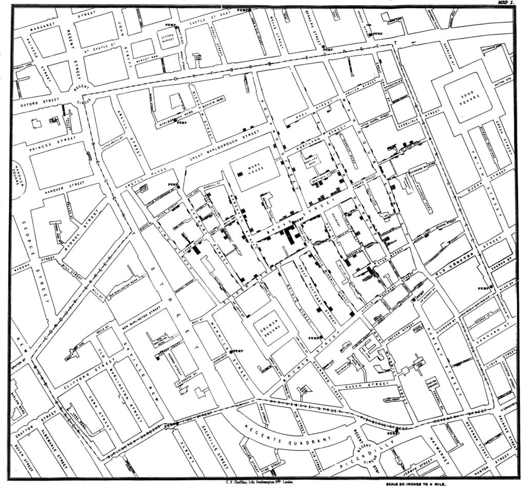
Example 1: 1854 Broad Street Cholera Outbreak Map
Scientists were not sure what was the main factor causing cholera to spread during its outbreak in 1854. It was not until John Snow depicted the outbreaks using the map below that scientists were finally able to tie it to the sewage systems used in the city.
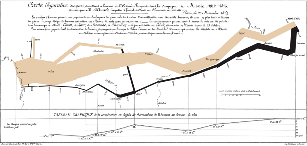
Example 2: Napoleon March Map
This is a visualization depicting how the size of Napoleon’s army diminished considerably during his march to Moscow in 1812 and how it can be tied to the temperature drops his army experienced.
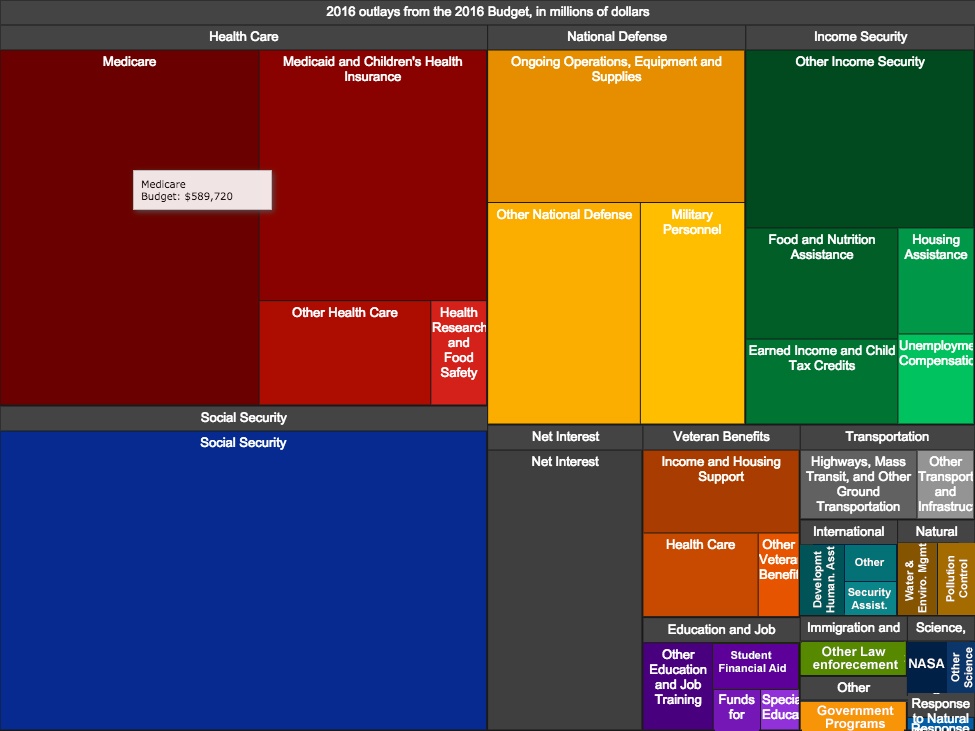
Example 3: Interactive Government Budget
This example serves as an effective use of interactive visualization to communicate a concept, which in this case is the use of tax money in 2016. Explore this link for a richer experience.
Notice how these visual representations provide an organized, quick, and memorable way to understand the data presented by each. Rather than sift through rows and rows of data entries, data visualization gets to the heart of what the author is trying to convey. This is much more convenient for demonstrating important information to those who are unfamiliar with the data and who wish to understand your conclusion in a quick and less technical manner.
Now that you have looked at some examples and have a better understanding of why data visualization is essential, it is time to practice making your own.
Pre-Workshop & Required Materials
Create a free account with Tableau Public using this link.
After creating an account, you will be prompted to download the free desktop application. Download either the Windows or Mac version depending on what type of computer you are using. You will be prompted to enter your account information upon doing so.
Now that you have Tableau installed and set up, reference these resources for getting a broader understanding of using Tableau to visualize data. They include tips for creating helpful visualizations, learning resources, and examples that other users have created.
https://www.tableau.com/learn/articles/data-visualization-tips
https://public.tableau.com/app/resources/learn?video=AZ-cy67GJck
https://public.tableau.com/app/discover/viz-of-the-day
After clicking on the Sample Data section, download the fictional dataset provided here.
Activity
Briefly look at the data set you have downloaded. It is always essential to understand the data you are working with. The better you understand your data, the better you can draw conclusions and account for unexpected values. To understand the data, take a look at how it is formatted, its size, and potential values for each attribute.
You may notice that the data file is in a .csv format. CSV files are a common format for organizing data. CSV stands for Comma Separated Values because if you look at the data, you will see that the values for each row of data are separated by commas. The first row of the data constrains the names of each column for that data point.
As you have look through the data, you can see that the headers of the data are:
- Property ID
- Property Name
- City, State
- Zip Code
- Type of Accommodation
- Number of Bedrooms
- Number of Bathrooms
- Maximum Occupancy
- Price per Night
- Rating (out of 5)
We will start off by entering our dataset. There are two ways to do this:
- As the image depicts below, select the “Text file” option, which will then open your computer’s files. Select the data file you just downloaded, and it will be saved under the Data Source section.
- From where you downloaded the dataset into your files, drag the CSV file into the Tableau page. It will then be saved under the Data Source section.
If your data is uploaded successfully, you will be able to see it under the Data Source tab on the bottom of the application. This is a useful view for working with the properties of your data.
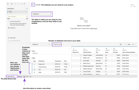
Data is typically organized into databases and tables. Though we are only concerned with one table of data for this workshop, in the future, you may find yourself combining multiple tables in order to get insights from them. When rows of the data share related information across tables, you will want to use what is known as a relation. On the other hand, if the data do not inherently relate to each other, but you wish to combine them based on column values that they share, you will likely wish to use a join feature.
In the Fields section of your table, you can see the properties associated with your data. You will notice that type is depicted with symbols, such as a #, Abc, or a globe.
- # represents numerical data. Tableau calls this type of data a Measure.
- Abc represents categorical data. Notice, Tableau calls this type of data a Dimension.
- The globe icon represents geographical data, such as a zip code that can be identified on a map.
After verifying that the data looks properly uploaded, navigate to Sheet 1 using the tab below. Here, you can see the main area for creating your data visualizations.
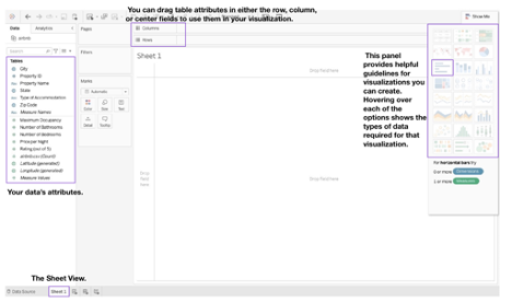
As shown in the image above, there are several types of visualizations you can use. There are also options to view data by page or add filters to your visualizations.
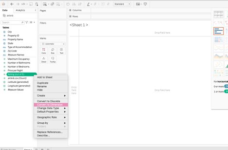
You may notice that ratings are automatically considered a Measure, because it contains numbers. However, ratings should be typically handled as categorical variables, since they are measured on a subjective scale. To convert it to a Dimension, left click on the attribute on the left panel, and select “Convert to Dimension”. Upon doing so, the Ratings attribute will appear above the black line separating the categorical and quantitative variables.
Next, we will be completing a few tasks to help us gain some insight into the data.
Task 1: Ratings by Average number of Bedrooms
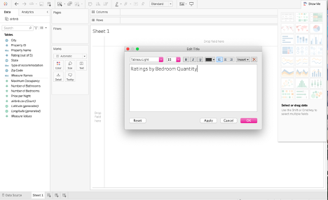
Name the sheet Ratings by Bedroom Quantity, as shown below, by clicking on the “Sheet 1” title.
Next, drag the “Number of Bedrooms” attribute to the Columns field and the “Rating (out of 5)” attribute to the Rows field.
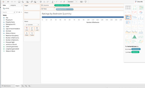
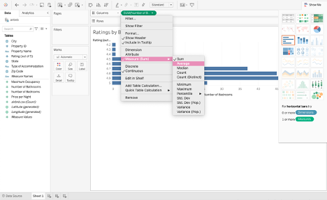
Tableau automatically organizes the data using a bar graph, but you can change the visualization if desired. You will notice that the sum of the number of bedrooms is depicted. However, we wish to compare the ratings based on the average number of bedrooms. Therefore, select Average as the Measure, as shown below.
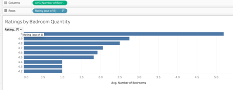
Lastly, select the sort button next to the Ratings title on the graph so the higher ratings are at the top of the graph, for improved readability. Though this is a simple example of a data visualization, already we can see a trend in the data, suggesting a positive relationship between the number of bedrooms of an Airbnb and the number of ratings it receives.
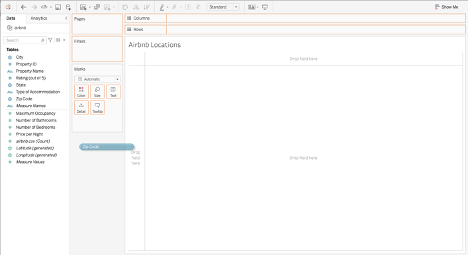
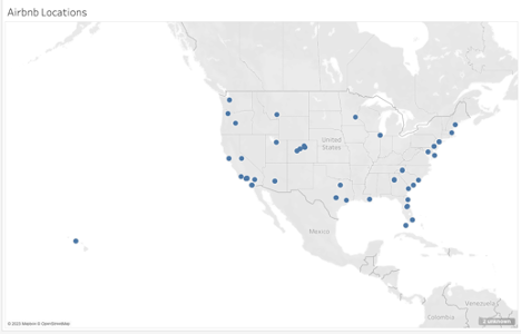
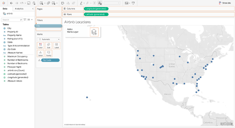
Task 2: Airbnb Locations
Create a new sheet and title it “Airbnb Locations”. Next, drag the Zip Code attribute to the center field. You will notice that a map appears, depicting the various data points by location.
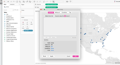
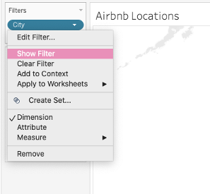
Next, we want to create a way to filter out those zip codes based on the city they’re located in. Drag the “City” attribute to the Filters section. A dialog box will appear, asking you what cities you want to filter by. To filter by all the cities, select the “Use all” option and press “Ok”. Next, click on the attribute and select “Show filter” to easily be able to select which zip codes are displayed based on their city.
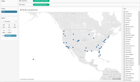
You have now created a way to visually see the Airbnb locations across the country.
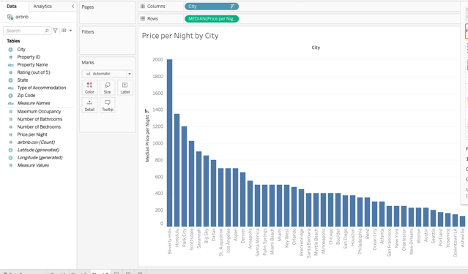
Task 3: Price per Night by City
Using the concepts you have practiced, try to create the following visualization of median Airbnb prices by city. Your result should look something like the example below.
Now that you have had some practice with Tableau, you may want to explore some further concepts and activities. Here are a list of useful future concepts to learn about that can enhance your general understanding of data.
- The difference between various types of data, such as numeric vs categorical data, and how to work with each.
- The role of a primary key in your table.
- Understanding more about the schema, or structure of your data.
- How to work with and combine multiple tables.
After getting to try out a useful data visualization tool, consider trying out some other useful tools for your data management and visualization such as the ones below:
- Visualize Free
- Google Charts
- Piktochart
- Infogram
- Many Eyes
- ChartBlocks
- CartoDB
Wrap-up Discussion
After seeing the techniques presented here and the impacts they have on consumers, consider the following questions individually or discuss them in groups:
- What are examples of data visualization you have encountered in day-to-day life?
- Can data be presented in a completely objective manner, or does it always present some form of rhetoric?
- How might data visualization be helpful for the organization you work with?
Congratulations on completing this workshop! Please consider giving us feedback in our survey linked in the button below so that we can continue to improve our workshops.