From Podcast to Platform: Re-thinking “Notre Dame Stories”

We’re changing our approach to podcasting.

We launched the Notre Dame Stories podcast in May 2018. Our charge was fairly open-ended: to showcase faculty expertise. We figured that would mean some kind of interview format, but it wasn’t long into our research before we learned that literally everyone was doing that. If we wanted to stand apart, we needed a wrinkle, some sort of twist. Our solution at the time was to blend these in-studio interviews with storytelling from the field, using natural sound, music, and interviews collected at the sites where Notre Dame students and faculty are conducting their research and activities.

As a result, the Notre Dame Stories podcast was always two shows in one. 

While the mixed format did provide a wrinkle that set it apart from the standard interview-only podcasts, other logistical challenges arose: studio space had to be reserved, for one. This meant coordinating schedules with at least three parties: us, our faculty subject, and the studio. Also, with rare exceptions, the field-produced stories were comprised of re-purposed video content, and while that extended the ROI of the resources expended in collecting that particular story, it wasn’t sustainable given the amount of video Strategic Content actually commissions. (We use video in only about a third of our stories produced for ND.edu; our relevant video library was exhausted in the first season of Notre Dame Stories.) Moreover, analytics indicated some inconvenient truths: The two most popular episodes were relative outliers of the format. One was just a straight interview, the other was a show in which the interview and the storytelling were both framed neatly in the title of the episode. Subject matter synergy between both elements of the show was always the intent but was seldom attainable.

And then there was the name. Notre Dame Stories was billed as featuring interviews with experts contributing to some of the major news stories of the day, as well as stories of the people creating knowledge through research and scholarship. Obviously, that’s a mouthful to say when explaining it to someone. The truth is “Notre Dame Stories” is the colloquial name for the Strategic Content team, which produces the podcast. It wasn’t a great descriptor for what the podcast was, because again, we were putting two formats into one.

As these issues started to weigh heavily on our thinking, we set out to produce something rare in higher ed podcasting: a mini-series centered around a single topic told from the field with narrative, music, and natural sound. Tantur: Hill in the Holy Land gave listeners an in-depth look at the past and present of the University’s presence in Jerusalem, and benefitted from a clarity of purpose that was admittedly lacking in the overall Notre Dame Stories series. Tantur has been honored with a Platinum award from the Association of Marketing and Communications Professionals, one of just five podcasts to receive that honor in the global Audio Visual Arts Digital Awards competition.

July 23, 2019; Dome of the Rock mosque, foreground and Church of the Holy Sepulchre (gray dome) in background, Jerusalem (Photo by Matt Cashore/University of Notre Dame)

Perhaps most importantly, what producing Tantur taught us is that we can do both heavily produced storytelling and deliver compelling conversations, but it works better for us if the two are separate. And the more effort you put into the storytelling, the more rewarding and richer the end product can be.

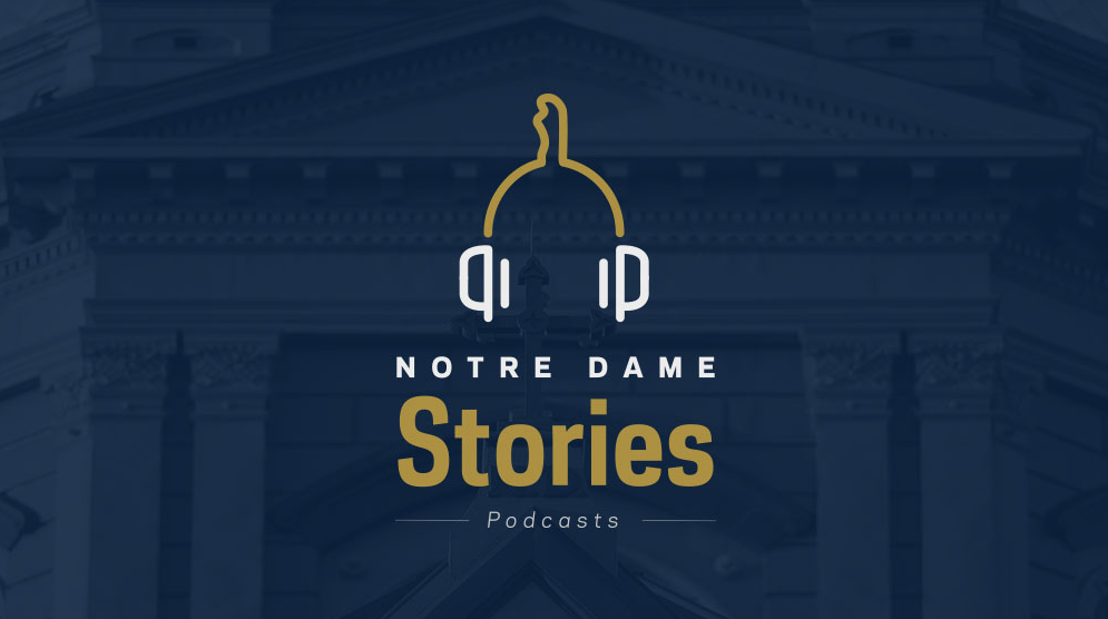
After considering our options and the best path forward, we came to the conclusion that Notre Dame Stories will cease to exist both as the solo moniker for our podcast execution and the format it has heretofore represented. Instead, Notre Dame Stories will be an umbrella under which various series will be presented. Collectively, these series will be known as Notre Dame Stories Podcasts (as in the image at the top of this post). The change will give us more flexibility to give utmost consideration to the most compelling way to deliver content in this format.

The first series under this new organization was Tantur: Hill in the Holy Land. The next series, beginning Friday, March 13, will be known as Office Hours.

Office Hours will feature conversations with faculty in their offices. We’ll talk about their research…and whatever else we happen to find there. That’s the thing about offices: They tell a story themselves. If we can describe some of that in an interesting way, we hope to provide that elusive nuance to the standard interview format.

Office Hours will continue throughout the remainder of the semester, and likely will begin again in the new academic year. We have a couple of other ideas for series that we are currently working on, and are excited about the opportunities for storytelling they represent. You can see all our podcast series at stories.nd.edu/series/podcast. All of these will be presented in the Notre Dame Stories stream, wherever you get your podcasts.

Graphics Guidebook: Color Contrast Accessibility

Have you ever seen an image on Twitter that makes you cringe? Something where you might even say out loud, “oh, my eyes!” Normally these images include bright, or even neon colors, that clash with each other. Frequently, they include text on a plain background that is very difficult to read.

In a recent blog post, I discussed why we should all be using Closed Captioning and Alternative Text on videos and images that we post on social media. While both of those are crucial as we strive to be more accessible, we must also take into account the color contrast in images that we create.

This can be a problem both on- and offline as posters hung on a wall can have the same impact as an image included in a tweet, so it’s best to understand why color contrast can be an issue for people.

Poor color contrast causes eye strain for non-impaired users, but for those who have low vision, low contrast vision or color blindness the colors it can cause them to not even see the image at all. And because people who are color blind are able to see things that aren’t red, green or blue, they aren’t going to be using screen readers where they’ll be told what an image says.

Essentially, you’ve just erased the functionality of that image for 8% of the male population and 0.5% of the female population in the world.

So, how can we make sure that our images are up to the visual standards that make sure our content can be read by everyone?

At Notre Dame, we strive to adhere to the Web Content Accessibility Guidelines (WCAG). One such guideline has to do with color contrast on graphics. These color contrast ratio requirements apply to text and graphics that are essential for understanding the content or functionality.

And every graphic that is included in a social media post should reach the threshold of “essential for understanding the content or functionality” (otherwise there’s no point to include it, but that’s another blog post), which means that all of them should adhere to the WCAG guidelines.

At a minimum, the contrast ratio should be 4.5:1 (or 3:1 for text that is 18 point or larger, or Bold 14 point or larger).

Web Accessibility In Mind (WebAIM) has a Color Contrast Checker available for free that you can use when creating graphics to make sure they’re complaint. Even if you don’t understand the ratio, this tool boils it down to a Pass or Fail grade.

Here are two examples, side by side, the left fails, while the right passes. In each, I chose two of the brand colors for Notre Dame* and then dragged the foreground and background colors darker until they reached the appropriate contrast ratio.

Color Contrast checker showing a failing and then passing grade on text on a solid backgroundColor Contrast checker showing a failing and then passing grade on text on a solid background


If you are not color deficient or low vision, you might not have a problem seeing the graphic that fails the test, but we have to remember that we don’t want to exclude the 4.5% of the total population that deals with color contrast deficiencies.

And it’s also important to look at color contrast when you’re using text on top of an image as there may be portions of the image where the text is not contrasted enough or blends into the background.

We probably run into this problem more often than not on Stories as they’re often created on the go or without the benefit of sitting down and being able to test the color contrast. Fixing this can be as simple as adding a background color to the text box, but that doesn’t always work with the aesthetic you’re seeking. This is where an Instagram “hack” comes in handy – if you’d like to add a transparent colored overlay on top of an image you’ve taken in a Story, choose the pen tool, then the highlighter (second pen option) and choose a color then hold down on the screen for a few seconds. Ta-da! Now you can type text with a static color to contrast. Even adding a very light gray transparent background on top of an image that is barely noticeable can help exponentially with color contrast.

*This is a good reminder to check the color contrast even if colors are part of your brand standards (the two I chose are part of our secondary and tertiary colors) as they might not have been intended to use in this particular combination

Social Media Accessibility: Alt Text and Closed Captioning

The Internet is a very visual place, especially when it comes to social media. We’re constantly sharing tweets, posts, videos and beautifully designed websites across every platform. We work hard to pair images with appropriate text in a compelling way to share Notre Dame and our stories with the world.

But up until very recently the platforms where we tell these stories have left a portion of the populations out by being inaccessible to users who are hearing or visually impaired.

That’s changing, though, as Instagram rolled out a straight forward option to add Alt Text for those using the platform with screen readers in late 2018. Facebook and Twitter also have the option to add Alt Text to images but you have to dig a little deeper to find it.

And while the option to add Closed Captioning or Subtitles to YouTube, Facebook and Twitter videos isn’t new, it’s just as important to help make all our visual content accessible to those who may be hearing impaired. (Not to mention the 85% of social media users who watch videos with the sound off.)

Here’s how to make our content accessible to the hearing and visually impaired: Continue reading Social Media Accessibility: Alt Text and Closed Captioning

When in Rome

October 9, 2018; Colosseum in Rome, Italy. (Photo by Barbara Johnston/University of Notre Dame)

In October 2018, ND Stories, Video ND and Photos ND traveled to Rome to capture several stories that showcase the University’s presence and work there. These pieces will be published over the next six months on ND.edu and our social channels. Here’s a quick preview:

“Cultural Maintenance”: A Notre Dame alumna is working at the Vatican Museums in the area of art restoration. (The Vatican Museums houses the largest complex of art restoration labs in the world.) She’s gaining an incredible amount of insight into how the Vatican maintains culturally priceless pieces of art. Publish date: Mid-November, 2018.

Historic Urban Environments (HUE)The Historic Urban Environments initiative within the School of Architecture has a new project: Cities in Text: Rome. It allows users access to rare travel guides from the 16th, 17th, and 18th centuries while exploring historic Rome. HUE/ND, comprised of librarians, architects, computer scientists, programmers, and students, has partnered with the American Academy in Rome to digitize, translate, illustrate, and map three historic guides and build them into a ‘research tool’ (website) and ‘discovery tool’ (mobile application) which allows users to understand the history of the city and how it’s been viewed and understood over time. Potential publish date: January 2018

The Rome Global Gateway: Inaugurated in 2014, the Rome Global Gateway provides the physical anchor of Notre Dame’s programs in the Eternal City. It is located steps from the Colosseum and is home to both the Rome International Scholars Program and the Rome Studies Program in the School of Architecture. It is a vibrant and dynamic hub of activity for undergraduates, graduate students, and faculty who are pursuing various academic endeavors in Rome. Publish date: TBD

The Humanitarian Corridors Initiative: The Humanitarian Corridor Initiative seeks to allow refugees from African countries to resettle in Italy. They are being placed in Catholic faith communities, and Keough School of Global Affairs faculty are studying the role of faith in the resettlement process. We spoke with one family who migrated from Eritrea after government persecution. Publish date: TBD

The 50th Anniversary of the Rome Studies Program: In April 2019, the School of Architecture will mark 50 years of its students spending one year of their five-year program in Rome. We look at how and why the year in Rome has remained a centerpiece of Architecture at Notre Dame. Publish date: April 2019.

It goes without saying that the photos and video captured in Rome are stunning. We’re looking forward to rolling these pieces out. Huge thanks to staff and faculty in Notre Dame International and the School of Architecture who made story-gathering in a remote location so much easier. We were fortunate for their help, and are lucky to count them as colleagues.


We’re blowing up ND.edu

The journey has begun.

We’ve started down the long path of redesigning Notre Dame’s flagship digital property, ND.edu. Candidly, we recognize it’s probably overdue. (Think cobbler’s kids’ shoes.)

Some history: The current site was launched April 1, 2012, and for reasons we won’t enumerate here, it was built rather quickly. As in, over the span of a couple months. The result was extraordinary especially given the time crunch. ND.edu received recognition from outside the higher ed community as a groundbreaking achievement in responsive web design.

The problem, of course, is that the site has changed very little in six years. That’s a long time in the web world and it’s been a long time in the Notre Dame universe as well. To wit, three of the offices that handle top level, crucial University priorities–Notre Dame Research, Notre Dame International, and the Office of Mission Engagement and Church Affairs–were in relatively nascent stages in 2012, if they existed at all. (Note: these aren’t the only offices that handle the priorities of research, international and faith.) Within our own Office of Public Affairs and Communications (OPAC), only two of the eight team members who are involved in the redesign project were here when the current site launched. 

We have a proposed roadmap for the project: 

  1. Deep analytics review: We wanted to get really smart about how people are using the site, and how it lined up with original intent of design and functionality. Is the site operating like it’s supposed to?
  2. Peer benchmarking: How are others handling the common issues in higher ed web design? Are there insights or best practices relevant to ND?
  3. Establish goals.
  4. Stakeholder engagement: Begin a series of check-ins with communicators in various other colleges, schools, and administrative units to apprise them of our progress and gain their input. 
  5. Content needs assessment
  6. Information architecture
  7. Design
  8. Build

We’re currently somewhere between numbers four and five on the chronology, though initial design work has started as well, mostly in the way of style work.

Analytics

Some high-level takeaways from the analytics review: Overall page views on ND.edu are falling, and have been for a few years. We’re generally ok with that, as our data shows this can be largely attributed to increased health of the Notre Dame webisphere writ large. It used to be that in order to get information on a given part of Notre Dame, you had to visit ND.edu. Now, through the good work of the Notre Dame Marketing Communications unit and campus partners, websites for specific colleges, schools and administrative units are functional, beautiful, and well-trafficked. Those views that were once hitting ND.edu are now going straight to a desired source of information. That’s good. And notably, the decline in views to ND.edu is leveling out. (Meanwhile, views of m.nd.edu – the Notre Dame mobile app – have grown by more than 500% over the last four years. That’s another blog post for another time. The app is not just a re-formatted ND.edu. Views of ND.edu on mobile devices are included in the overall number, the blue line in the chart below.)


Other highlights: Academic content is clearly the most-viewed content. No surprise. Also: the Features section – that’s ND Stories content – continues to see marked growth in traffic even now into its third year. It is helping (if even in a small way) to stem the tide of overall declining ND.edu traffic.

The internal use case for ND.edu came to the fore in the analytics review as well. Whether conducting business, registering for classes, or even getting to their email, faculty, staff and students all hit ND.edu for items that are more directly handled on other University sites. A consideration for how to efficiently handle this audience case will be a part of the project. 

There are more analytics charts – the committee received about 50 of them – but suffice to say, we saw enough to feel good about certain sections of the site, and less-than-good about others. 

Benchmarking

The other piece we’ve looked at is benchmarking against peer institutions. While it’s critical you do what’s best for you, there are plenty of smart websites out there that can provide inspiration, especially on mutually applicable issues. 

We looked at the sites of the top 50 in the U.S. News and World Report rankings, and tried to find relevant takeaways for ND.edu. A short list:

  • Notre Dame was rare because we didn’t have a “Campus Life” section. It’s an odd thing because the University has an unsurpassed undergraduate experience, and generally likes to talk about it, yet it is not called out as explicitly on the site. 
  • ND was one of only 3 to have a spiritual life mention (Pepperdine, Boston College). 
  • Research is currently a secondary navigation item. It’s tucked up above the main nav, kinda out of the way. It’s almost always a primary navigation item everywhere else.
  • And lastly, other sites have a more focused, intentional approach to their news and features. That is to say, many schools have specialized news sections, aimed at specific audiences or topics, or filterable content. And the hero space almost always fell into one of two categories: featured news/storytelling, or branded, “this-is-why-we’re-awesome” content. OPAC is structured in such a way that we are well-positioned to tell stories and produce dynamic content, but the current site does not reflect those abilities. 

Takeaways

None of the above should be viewed as prescriptive for how we’re going to change ND.edu. Rather, it’s a sampling of the homework on our current site to this point. We have some work to do in IA and functionality, as well as the overall look and feel. It will all be addressed and subsequent blog posts will offer some insight into our decision making along the way. We have three very broad goals for the project. These are combo messaging/usability objectives, and (spoiler alert) they’re pretty generic. But they’re based on needs we feel the current site isn’t meeting, or could meet better, and in that way they are very appropriate:

  1. Reinforce ND’s positioning as a Catholic research institution with an established and growing international presence.
  2. Show the breadth of the Notre Dame experience while providing clear information for people coming to the site to learn and do.
  3. Create greater consistency in Notre Dame’s web presence. (This is a big one, and we didn’t get into it much in this post for good reason. Basically, ND.edu is being outpaced by some subdomains in aesthetic quality, at least. And it’s not the only University site in this boat. Greater consistency is in order, and appropriate application of updated design templates across the University will be a monumental undertaking.)

We have a working timeline for completion, but we’re not going to post it here because that just invites a missed launch date. The project is a collaboration between the ND Web team and Strategic Content, with critical insights being pulled from communicators across campus, all of whom share (to some degree) our excitement over the project. Here’s to the journey.

5 Tips to Combat Falling Reach after Facebook’s News Feed Change

Two weeks ago, Facebook announced a major change to their News Feed which they titled “Closer Together.” It’s been talked about substantially by many major media outlets – who will be greatly affected by the change – and others across industries that use social media (including me last week), but what is it really going to mean for those of us here at Notre Dame?

In last week’s blog post, I discussed that we now have a hierarchy of engagements defined by Facebook’s News Feed Chief Andrew Mosseri:

Likes < Reactions < Comments < Long Comments

While it was always crucial for brands and publishers to post engaging content to reach more people, it is even more important now as Facebook has spelled out that brands and publisher pages will see their reach, video watch time and referral traffic to websites decrease; many predict these metrics will decrease dramatically.

In 2017, the University of Notre Dame Facebook Page posted 298 times and reached an average of 53,500+ people on each of those posts. This was a 38% increase in average reach over 2016 when we posted 294 times and reached an average of 38,600+ people on each post.

That 2017 number increased so considerably because our organic reach evened out considerably. In 2016 our highs were very high and our lows were very low — 51 of our posts did not reach 10,000 people. In 2017, there were only 10 posts that did not reach 10,000 people or more.

I attribute that growth and sustained reach to the fact that we always posted with intention – never posting just to post – and we had great success with links to our Strategic Content features and videos on the site.

In 2018, I can already tell you that we’ll be closer to that 2016 number for posts that reach less than 10,000 people if we don’t exceed it.

Last week, I posted two news stories that failed to meet that threshold – one was an invitation to the January 22 MLK Celebration Luncheon featuring David and Corey Robinson and the other a link to the 2018 Driehaus Prize Laureate announcement. Both of these items would have reached about 20,000 people, if not more, in the News Feed of 2017, but because they collectively received 351 likes, 11 shares and 7 comments (most of which were “Congrats!” or “Wonderful!”). In other words, because the posts did not engage others as much as Facebook requires, Facebook didn’t show the posts to as many people.

On the other hand, our post on the more than 1,000 students, faculty and staff traveling to Washington, D.C. for the March for Life reached a handful more people than a similar post last year even though this year’s post was much more engaging with 5,000 people commenting, reacting or sharing versus last year’s 3,000.
Engagement matters. That’s the name of the game here.

So how do we write posts that engage our audience? It’s going to be very difficult, especially if you’re trying to primarily reach a student audience (for all the reasons described last week) and if your content is primarily news- or event-based.

We’re going to have to become better storytellers and explore the “Why?” of a piece of content. Why does this matter to my audience?

We’re going to have to move beyond headlines and share the meat of a story while still keeping in mind how a post will appear in someone’s newsfeed. Here are some strategies that we’re going to try to be more engaging:

Get to the point faster

Facebook inserts a line break after 7 lines of text or about 220 characters. The majority of people will not click to read more. Put links and calls to action before this point.

Post longer videos

Long videos perform better than short videos even after the algorithm change. If you’re sharing something with a video attached make sure the video is longer than 30 seconds or you’re already hampering the post. Make sure the you’re making your video as accessible as possible, too:

  • Make sure the video begins in the action, too. You have to capture someone’s attention immediately, so leave brand marks for the end of a video
  • Create your video to be consumed silently, too. Either include closed captioning or create a video with text on the screen as most people will not click to turn the sound on.

Post more frequently

This is not something I ever thought I would say as I treat the University’s Facebook page as the equivalent of nd.edu – we don’t post multiple new things on nd.edu every single day so we didn’t post that many on Facebook either. With this new algorithm, however, it seems like posts have a shorter shelf life. Posts used to reach people throughout a 24-hour period and then much slower after that. I’ve noticed that on posts since the News Feed change, our reach has considerably slowed within the first 12 hours. Consistency will be key to see if posting more frequently will reach more people, or reach that same small number of people.

Use Live video very sparingly

Facebook has already said that Live Video will perform better than pre-produced video in the News Feed environment, so we should all switch to going live, right? Wrong. Live Video should only be done sparingly and for events that it makes sense for. Because many people get a notification when your page goes live you’re interrupting their day and you better make it worth their while.

Consider consolidating pages

This could be the most controversial of all the things I say about the new News Feed because we all like to feel an ownership of our audiences and our content. Facebook has told us that groups will feel this News Feed crunch less than pages, and Facebook pages now have an option for sub-groups. If, in a few months, campus partners are still seeing severely decreased reach it may make sense to begin a conversation of consolidating centers and institutes under an umbrella heading with subgroups for each constituency under that page. So far there are no plans to do this on campus, but the option is still there as having more units contributing to one page could help with consistency and engagement.

Facebook “Closer Together”: What does it mean for Notre Dame?

Golden Dome at Night

On January 11, Mark Zuckerberg took to his own Facebook account to announce a major change to Facebook’s News Feed, now called “Closer Together” by the company, with the intention to make sure “the time we all spend on Facebook is time well spent.”

For Zuckerberg and Facebook, that means they want to increase the amount of content you’ll see from your friends, family and groups in your News Feed and they’re going to decrease the amount of content you see from businesses, brands and media on the platform.

While all of this sounds like it could cut down on the amount of fake news, clickbait and overall dumb posts that we all see on Facebook it will also cut down on the reach of all of our posts from pages across the University.

This isn’t the first time that Facebook has tweaked its algorithm and we’ve always managed to respond with a shift in the way we deliver content. In the past three years, we’ve worked hard to build an engaged community by delivering very strong, well-designed written content in links to articles from Strategic Content, pivoting to compelling video that can help us tell our story (like introducing Fr. Greg Boyle as the 2017 Laetare Medal recipient), and posting on a consistent schedule with a consistent tone of voice on the University’s page – but this time feels different.

Organic reach on Facebook has been declining since 2011 with a more rapid decline happening since March 2014. Many of the 65 million pages on Facebook currently average 1 to 2 percent organic reach. Many pages in higher education and publishing saw double digit declines in average organic reach in 2017.

But this is the first time that Facebook has been so open about what their plans are for brands and publishers on the platform. While in the past the company has announced algorithm tweaks that they claim will focus on friends and family, or that they will diminish the reach of posts that utilize click baiting (“Top Ten lists. You’ll never BELIEVE what number 7 is” May 2017) or engagement baiting (“Tag a friend who needs this!” December 2017) tactics. But this is the first time that Mark Zuckerberg has posted to explain a fundamental shift in Facebook’s future direction. He has said that he expects people will spend less time on the site and he is OK with that as it will be better serving the original goal of Facebook – to connect friends and family – and people will no longer be passively consuming videos or information.

While it’s always been true that Facebook’s algorithm rewards content that people engage with, it will be even more important now – and the types of engagement now has a defined hierarchy:

Likes < Reactions < Comments < Long Comments

Anything that takes longer to do on a phone (56% of Facebook users ONLY log-in on a mobile device) is weighted more heavily than things that are simple. Liking is easy, but hovering over the like button and choosing “Love,” “Haha,” “Angry” or “Sad” is harder. Saying “Congrats!” is easy, but saying something in depth and beginning a conversation is harder. Facebook will be showing those posts that provoke a reaction or in-depth comment more than it will show posts that are just liked.

So what does this mean for those of us here at Notre Dame?

The jury is still out as Facebook is rolling these changes out over the next few weeks, but it looks like it will have far reaching consequences for Facebook pages on campus especially for those accounts who are primarily trying to reach students there.

We know that students (still) use Facebook but they are primarily passive users. They check in with friends and family, follow brands and pages that they find value in, and occasionally post photos to let their parents and extended family see what they are up to. They do not often actively engage with pages or brands – they don’t comment, they don’t like and they don’t share. And more importantly, they won’t be changing their engagement behavior on Facebook, no matter how much we’d like them to so that our content will be served to as many people as possible.

That means that we’re going to either need to find out new ways to present our content on Facebook to entice them to engage (something I’ll be talking about in a subsequent blog post) or we’re going to need to discuss new ways to try to reach students either on a different social platform, by consolidating individual Facebook pages into broader focused pages or by shifting to groups under one broader focused Facebook Page umbrella.

I can tell you that the University of Notre Dame Facebook page is already seeing the effects of this News Feed change and has been for a few months. We’re primarily experiencing a decline in the reach and views of static videos. Andrew Mosseri, Facebook’s News Feed chief, has blatantly said that this is a direct result of Facebook’s desire to deliver the most engaging content to users instead of passive experiences.

“Video by nature is very passive,” Mosseri said in an interview with Wired Magazine. “So while you’re watching a video on Facebook you don’t tend to comment a lot, like a lot, or talk with your friends a lot, or read articles for that matter.”

I’ll continue to blog about our experiences with Facebook as these news feed changes take hold in the market. Check in for a blog post on what we can do to promote engagement and try to combat this decline in organic reach soon.

BTS: Creating the 2017 Notre Dame institutional spot

Editor’s note: This post from director of marketing communications multimedia Beth Grisoli takes a look behind the scenes at the making of Notre Dame’s 2017-18 institutional spot, which debuted during broadcasts of Notre Dame football games and will continue running during televised athletics events during the school year. Marketing Communications Multimedia has produced the spot internally for the past four years. 

So you want to put movies on buildings for our 30-second spot? I don’t understand.

 Um, well, yeah, we think it will be cool.

And so went the meeting with our division vice president to pitch the concept of this year’s institutional message (I’ll explain why it’s not a commercial later). Lucky for us, he took a leap of faith and gave us his blessing.

So much goes into the planning and creative process for these videos. We only get 30 seconds, and boy that goes by fast. And we have to come up with something different and exciting every year. Oh, and millions, not kidding, millions of people of all ages will see it. But this year’s production will be one our team talks about for years like a bunch of old geezers.

Remember when we got those 30K projectors and shot overnight for three nights in a row?

 Yeah, and you fell asleep in your car and everyone was gone when you woke up?

 It took 30,000 lumens of light from two projectors to make the images bright enough on the buildings. Each projector is almost the size of a refrigerator on its side. It takes two hours to get them set up, converged and mapped correctly with the software on each building. They required a separate generator to power them. Our friends at ND Utilities helped us with that and also disconnected the streetlamps and entrance lights that would be in each scene. We covered others with black bags to cut the spill from them. We needed it dark. As pitch black as we could get it. And with Indiana on the edge of the Eastern Time zone, daylight never seems to end during the summer. So that meant not even starting until about 10:00 each night.

We begged some students who happened to be on campus this summer to show up each night around 10:30. ND students are always great – eager to help, polite, and these didn’t complain when midnight came and went and we asked them to continue staring at the buildings.

Night 1 – We began at the log chapel. Made a coffee run to the office – absolutely nothing else was open – and then moved to the Clarke Memorial Fountain (Stonehenge). There we cranked up the projectors again and wrapped up around 3:15 or so in the morning.

Night 2 – We set up at the Main Building. Had to go through the entire building floor by floor to make sure all lights on the front side were off and blinds were lowered. It actually took about 45 minutes to do that. Finished with the dome and then rotated the projector 90 degrees to throw the video onto the side of the Basilica. I may or may not have been caught sacked out on a bench by the end of that shoot.

Night 3 – The scene was the Hesburgh Library and rain was in the forecast. Electronics and water don’t mix, and these massive contraptions aren’t grabbed and rushed to cover with any effort that resembles speed. Our crew was able to set both up (stacked to cover the entire span of the library’s west side) inside the back end of the production truck. When the rain came, and it did with thunder and lightning, they rolled down the back door. Thanks to super wopper Doppler apps, we were able to get all the students into the library before a drop even fell. About 30 of them hung out, kept their usual good spirits and patiently waited out the storm to come back out onto the wet grass to finish the shoot. Did I mention how much I love our students?

We wrapped up the shots with them and needed to stay to shoot more of the video on the building. Maybe 20 minutes later, a sprinkler shot on near the library door. We all just looked at each other. We had painstakingly arranged for sprinklers to be turned off at all our locations. Believe it or not, they run in the middle of the night. Minutes later all the sprinklers burst on and we were hit. The projectionist and computer tech literally jumped on top of them while the rest of us scrambled to get the gear covered and to safety. If I’m ever in combat, I want these guys on my side. They got completely soaked. We were so ahead of the game preparing for the rain, but the lawn care gods almost did us in. They probably lasted less than ten minutes, and we decided it was a wrap. The very next day we started the geezer stories with our colleagues.

We learned a lot with this project. Used a new technique and had fun thinking about ND’s 175th anniversary throughout. When we showed the edited video to our VP, he smiled and said, “I get it now.” We hope the millions watching get it too. ND has this impressive history and still stands today, stretched well beyond the confines of that little log building, alive with smart, energetic students who will follow you into the wee hours of the night to help a cause they believe in.

And before I forget, it’s not a commercial because we don’t buy the airtime. Broadcast networks provide 30 seconds of airtime to universities during any telecast of their athletic competitions. They call it an “institutional message” and it has to meet certain criteria and be approved by the networks for content.

BTS: The Pearls of Africa

In 2013, Notre Dame hosted its first class of fellows in the Young African Leaders Initiative (YALI), a program run by the U.S. Department of State. The initiative brings young entrepreneurs from all over the continent of Africa to study at one of a handful of U.S. universities for six weeks during the summer. Each year since, a new group of 25 has come to Notre Dame.

For a storytelling unit, the opportunity for compelling content related to the program is deceptively challenging. Literally every one of the fellows selected has a remarkable story of determination, intelligence and savvy. They’ve all accomplished so much in their home countries by the time they arrive in the U.S. that selecting a single “success story” is impossible.

We set out to find a “proof of concept” story – a piece that could show how the knowledge gained here at Notre Dame was impacting and advancing the endeavors of the YALI fellows after their time in the States. Again, the choices were plenty. We ultimately decided to reach out to Eve Zalwango, a woman who owns a furniture making business in Uganda. Eve employs victims of landmine accidents, casualties from Uganda’s civil war (the conflict that prompted the “Make Kony Famous” campaign in 2012). Many of these people have lost limbs, and find it difficult to make a living in Uganda’s manual labor economy.

March 13, 2017; Landmine victim in Kasese, Uganda. (Photo by Barbara Johnston/University of Notre Dame)

When our writer and photographer returned from Uganda, we reviewed the images captured there. They were, simply, stunning. So much so that we decided to approach this story a bit differently than others. Whereas in the past the images served mostly to enhance and deepen the understanding of the text, we felt we would try the opposite approach: text as an enhancement to photos. Far from a typical photo essay, however, we wanted a certain chronology to the events and, where necessary, we wanted the pictures to move.

The result is an experience that follows Eve’s story from the founding of her furniture business to her encounter with landmine victims, to her future plans to establish a non-profit training center.

Of particular note:

  • This technique requires rigid adherence to a timeline. It sounds simple, but the flow of the story couldn’t be established without preparing the visitor for the next step. In feature writing, certain anachronisms are allowed and can even be useful. Not here. It was more challenging than we thought going in.
  • Notice the use of black. We used text on a black background mostly to allow key messages or facts to stand on their own, starkly, without accompaniment. The visual impact of white text on black is striking, and in this way we even used text as an “image” to tell the story.
  • The safari pictures were fascinating in their own way. That was an add-on to the trip; it wasn’t part of the original itinerary. There was a concern that including these photos in a gallery would seem too cliche. But interestingly, Eve said it’s rare for Africans to go on safari, in a way, the novelty just isn’t there. But she enjoyed the voyage as much as our crew.
March 14, 2017; A tour of wildlife in Queen Elizabeth Park with Kagera Safaris, founded by YALI fellow Miriam Kyasiimire. (Photo by Barbara Johnston/University of Notre Dame)

Telling this type of story this way begins with the images. In the future, we’d probably prescribe this output before we even set out to gather the story. But either way, the images must be incredibly compelling to warrant this treatment. Credit to the Notre Dame Multimedia’s Barbara Johnston for this work, as well as the writing of Brendan O’Shaughnessy.

Please Boomerang Responsibly

LimeBikes at Notre Dame
Click to see Notre Dame’s first Boomerang

We’ve all seen them. One second looping videos that show our friends stuck in a perpetual dance loop, or jumping up and down repeatedly, or winking at the camera exaggeratedly on and off for all eternity. Boomerang has become fairly ubiquitous on Instagram and other social media platforms since it was launched as a standalone app in October 2015.

When your friends use Boomerang it’s a fun way to show their personality, but we all know that your friends aren’t the only ones using the app. Brands like to jump on anything new, shiny and “hip” to try to connect with their audience on social platforms and have varying levels of success.

Some of these new, shiny objects can actively harm a brand – using Facebook LIVE too often or on mundane activities can cause your audience to unfollow you permanently even if they still like your page; Instagram Stories that don’t even remotely tell a story teach your audience to immediately swipe off your story when it pops up regardless of if your content is now worthwhile; and users will not engage with your Snapchat if there’s no objective or pay off for them. Suddenly that shiny new feature that was supposed to show your followers that you’re “cool” and “hip” on social media has left you with a less engaged audience.

But then there’s Boomerang.

On the surface, using Boomerang – the app that creates gif-like looping videos – probably won’t lose a brand any followers unless it’s the only thing they post, but its misuse is more glaring than any of the others.

Instagram is a platform where users expect compelling visual content from brands. Boomerang, on the other hand, is highly visual but in a less polished way. The aesthetic awkwardness that a bad Boomerang produces is jarring in relation to the beautiful images that surround it in a feed or bookend it in an Instagram Story. It takes just the right subject or just the right timing to make a Boomerang work.

The best Boomerangs either weren’t done in one take or they were perfectly positioned with an artistic eye to capture something that would only happen once … and yeah, sometimes you can get lucky and get a cool image without even meaning to (like I did with an airplane and the Golden Dome), but you can’t rely on getting it right in one take. Unless you can dedicate some time and energy to creating a Boomerang (and really, you should be dedicating some time and energy to everything you post on social media) it’s best to stick with the features available within Instagram itself.

The moral of the story is that you shouldn’t be using Boomerang, Facebook Live, Stories, or any other shiny objects that social networks roll out without first understanding your own brand and how these features fit into it. And you definitely shouldn’t be using them if you haven’t figured out how each social network that they attach to fits into your brand.

If you feel like you HAVE to Boomerang something, though, there are some easy tips that you should follow:

  1. Make sure you (the cameraperson) are not moving – if you AND your subject are moving the resulting jostling in the final video will be distracting at best and cause motion-sickness at worst.
  2. If at all possible, focus on something static – Boomerangs work best when the moving portion of the image accentuates the static portion rather than overpowering it.
  3. Clue your subject into your plans – Using Boomerang without the knowledge of your subject results in some awkward video loops. They should be aware that you are plan to Boomerang and should be doing something noteworthy – walking or running doesn’t generally lend itself to a good use of Boomerang.
  4. Take A LOT of Boomerangs and choose the best one – This is where people get hung up most often. Good social media –  just like good writing or good photography or good video – takes time. Sometimes you may get lucky and get it on the first take (and sometimes you HAVE to because something is only happening once), but even when someone nails it on the first take you should take at least two more videos to make sure that it’s the best take. (For example, the first Notre Dame Boomerang is the product of over 30 different takes in two different locations on campus.)
  5. Don’t be married to the idea of Boomerang – This goes hand in hand with making sure you have options. Sometimes you have every intention of using a Boomerang and it just doesn’t turn out like you were expecting. At that point you may have to scrap your plans and go with something else to tell your story on social media.