Have you ever seen an image on Twitter that makes you cringe? Something where you might even say out loud, “oh, my eyes!” Normally these images include bright, or even neon colors, that clash with each other. Frequently, they include text on a plain background that is very difficult to read.
In a recent blog post, I discussed why we should all be using Closed Captioning and Alternative Text on videos and images that we post on social media. While both of those are crucial as we strive to be more accessible, we must also take into account the color contrast in images that we create.
This can be a problem both on- and offline as posters hung on a wall can have the same impact as an image included in a tweet, so it’s best to understand why color contrast can be an issue for people.
Poor color contrast causes eye strain for non-impaired users, but for those who have low vision, low contrast vision or color blindness the colors it can cause them to not even see the image at all. And because people who are color blind are able to see things that aren’t red, green or blue, they aren’t going to be using screen readers where they’ll be told what an image says.
Essentially, you’ve just erased the functionality of that image for 8% of the male population and 0.5% of the female population in the world.
So, how can we make sure that our images are up to the visual standards that make sure our content can be read by everyone?
At Notre Dame, we strive to adhere to the Web Content Accessibility Guidelines (WCAG). One such guideline has to do with color contrast on graphics. These color contrast ratio requirements apply to text and graphics that are essential for understanding the content or functionality.
And every graphic that is included in a social media post should reach the threshold of “essential for understanding the content or functionality” (otherwise there’s no point to include it, but that’s another blog post), which means that all of them should adhere to the WCAG guidelines.
At a minimum, the contrast ratio should be 4.5:1 (or 3:1 for text that is 18 point or larger, or Bold 14 point or larger).
Web Accessibility In Mind (WebAIM) has a Color Contrast Checker available for free that you can use when creating graphics to make sure they’re complaint. Even if you don’t understand the ratio, this tool boils it down to a Pass or Fail grade.
Here are two examples, side by side, the left fails, while the right passes. In each, I chose two of the brand colors for Notre Dame* and then dragged the foreground and background colors darker until they reached the appropriate contrast ratio.
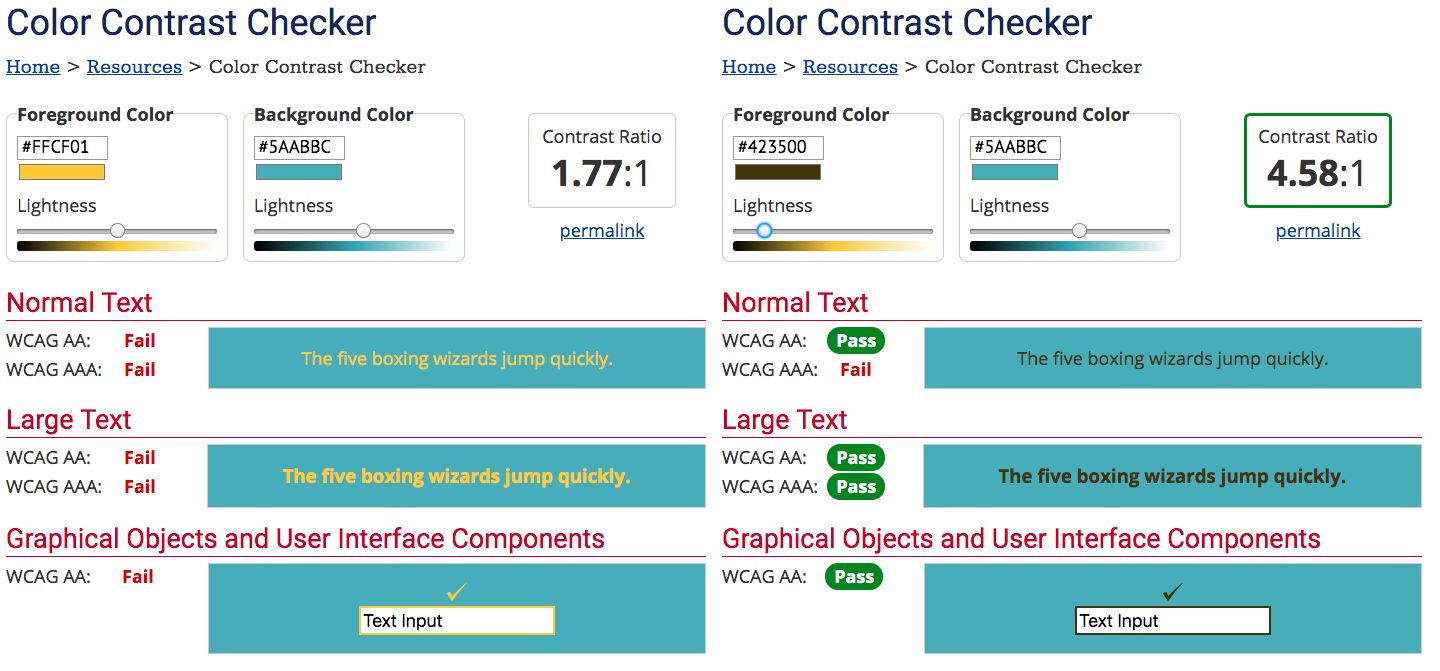
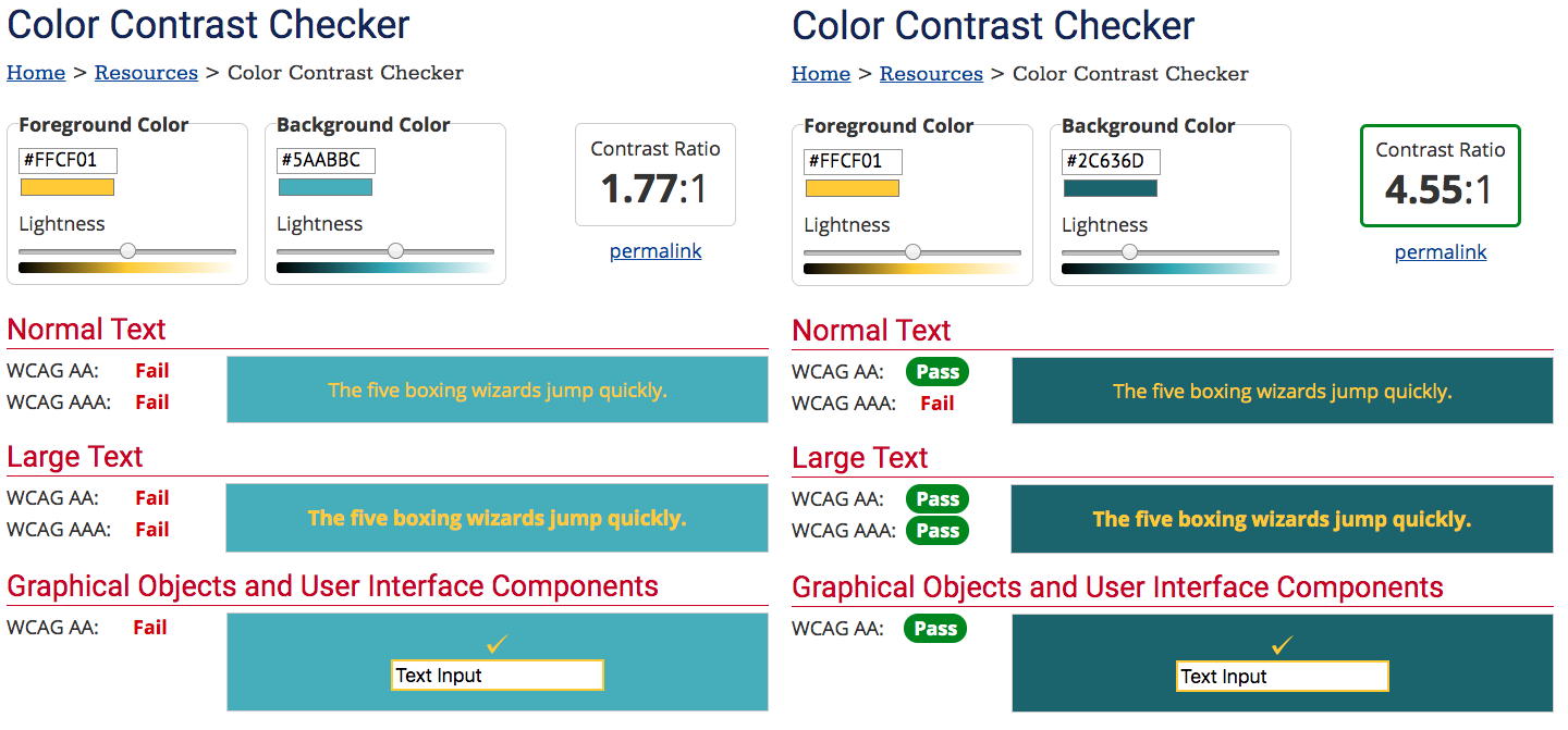
If you are not color deficient or low vision, you might not have a problem seeing the graphic that fails the test, but we have to remember that we don’t want to exclude the 4.5% of the total population that deals with color contrast deficiencies.
And it’s also important to look at color contrast when you’re using text on top of an image as there may be portions of the image where the text is not contrasted enough or blends into the background.
We probably run into this problem more often than not on Stories as they’re often created on the go or without the benefit of sitting down and being able to test the color contrast. Fixing this can be as simple as adding a background color to the text box, but that doesn’t always work with the aesthetic you’re seeking. This is where an Instagram “hack” comes in handy – if you’d like to add a transparent colored overlay on top of an image you’ve taken in a Story, choose the pen tool, then the highlighter (second pen option) and choose a color then hold down on the screen for a few seconds. Ta-da! Now you can type text with a static color to contrast. Even adding a very light gray transparent background on top of an image that is barely noticeable can help exponentially with color contrast.
*This is a good reminder to check the color contrast even if colors are part of your brand standards (the two I chose are part of our secondary and tertiary colors) as they might not have been intended to use in this particular combination