The journey has begun.
We’ve started down the long path of redesigning Notre Dame’s flagship digital property, ND.edu. Candidly, we recognize it’s probably overdue. (Think cobbler’s kids’ shoes.)
Some history: The current site was launched April 1, 2012, and for reasons we won’t enumerate here, it was built rather quickly. As in, over the span of a couple months. The result was extraordinary especially given the time crunch. ND.edu received recognition from outside the higher ed community as a groundbreaking achievement in responsive web design.
The problem, of course, is that the site has changed very little in six years. That’s a long time in the web world and it’s been a long time in the Notre Dame universe as well. To wit, three of the offices that handle top level, crucial University priorities–Notre Dame Research, Notre Dame International, and the Office of Mission Engagement and Church Affairs–were in relatively nascent stages in 2012, if they existed at all. (Note: these aren’t the only offices that handle the priorities of research, international and faith.) Within our own Office of Public Affairs and Communications (OPAC), only two of the eight team members who are involved in the redesign project were here when the current site launched.
We have a proposed roadmap for the project:
- Deep analytics review: We wanted to get really smart about how people are using the site, and how it lined up with original intent of design and functionality. Is the site operating like it’s supposed to?
- Peer benchmarking: How are others handling the common issues in higher ed web design? Are there insights or best practices relevant to ND?
- Establish goals.
- Stakeholder engagement: Begin a series of check-ins with communicators in various other colleges, schools, and administrative units to apprise them of our progress and gain their input.
- Content needs assessment
- Information architecture
- Design
- Build
We’re currently somewhere between numbers four and five on the chronology, though initial design work has started as well, mostly in the way of style work.
Analytics
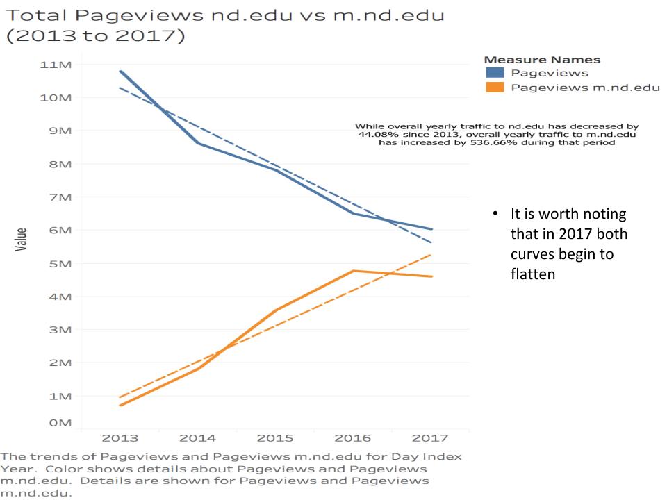
Some high-level takeaways from the analytics review: Overall page views on ND.edu are falling, and have been for a few years. We’re generally ok with that, as our data shows this can be largely attributed to increased health of the Notre Dame webisphere writ large. It used to be that in order to get information on a given part of Notre Dame, you had to visit ND.edu. Now, through the good work of the Notre Dame Marketing Communications unit and campus partners, websites for specific colleges, schools and administrative units are functional, beautiful, and well-trafficked. Those views that were once hitting ND.edu are now going straight to a desired source of information. That’s good. And notably, the decline in views to ND.edu is leveling out. (Meanwhile, views of m.nd.edu – the Notre Dame mobile app – have grown by more than 500% over the last four years. That’s another blog post for another time. The app is not just a re-formatted ND.edu. Views of ND.edu on mobile devices are included in the overall number, the blue line in the chart below.)
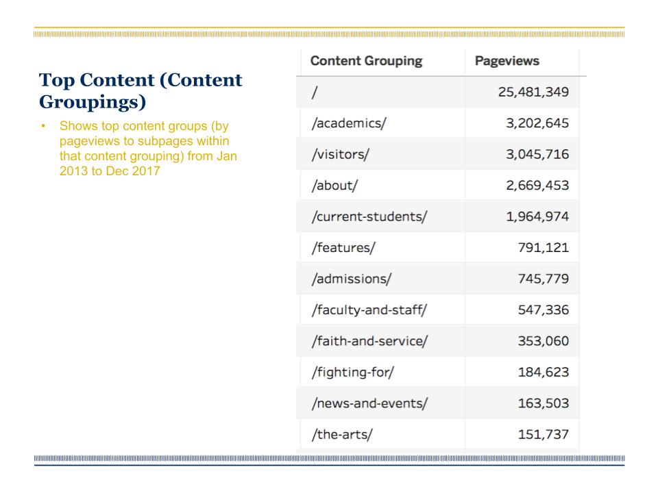
Other highlights: Academic content is clearly the most-viewed content. No surprise. Also: the Features section – that’s ND Stories content – continues to see marked growth in traffic even now into its third year. It is helping (if even in a small way) to stem the tide of overall declining ND.edu traffic.
The internal use case for ND.edu came to the fore in the analytics review as well. Whether conducting business, registering for classes, or even getting to their email, faculty, staff and students all hit ND.edu for items that are more directly handled on other University sites. A consideration for how to efficiently handle this audience case will be a part of the project.
There are more analytics charts – the committee received about 50 of them – but suffice to say, we saw enough to feel good about certain sections of the site, and less-than-good about others.
Benchmarking
The other piece we’ve looked at is benchmarking against peer institutions. While it’s critical you do what’s best for you, there are plenty of smart websites out there that can provide inspiration, especially on mutually applicable issues.
We looked at the sites of the top 50 in the U.S. News and World Report rankings, and tried to find relevant takeaways for ND.edu. A short list:
- Notre Dame was rare because we didn’t have a “Campus Life” section. It’s an odd thing because the University has an unsurpassed undergraduate experience, and generally likes to talk about it, yet it is not called out as explicitly on the site.
- ND was one of only 3 to have a spiritual life mention (Pepperdine, Boston College).
- Research is currently a secondary navigation item. It’s tucked up above the main nav, kinda out of the way. It’s almost always a primary navigation item everywhere else.
- And lastly, other sites have a more focused, intentional approach to their news and features. That is to say, many schools have specialized news sections, aimed at specific audiences or topics, or filterable content. And the hero space almost always fell into one of two categories: featured news/storytelling, or branded, “this-is-why-we’re-awesome” content. OPAC is structured in such a way that we are well-positioned to tell stories and produce dynamic content, but the current site does not reflect those abilities.
Takeaways
None of the above should be viewed as prescriptive for how we’re going to change ND.edu. Rather, it’s a sampling of the homework on our current site to this point. We have some work to do in IA and functionality, as well as the overall look and feel. It will all be addressed and subsequent blog posts will offer some insight into our decision making along the way. We have three very broad goals for the project. These are combo messaging/usability objectives, and (spoiler alert) they’re pretty generic. But they’re based on needs we feel the current site isn’t meeting, or could meet better, and in that way they are very appropriate:
- Reinforce ND’s positioning as a Catholic research institution with an established and growing international presence.
- Show the breadth of the Notre Dame experience while providing clear information for people coming to the site to learn and do.
- Create greater consistency in Notre Dame’s web presence. (This is a big one, and we didn’t get into it much in this post for good reason. Basically, ND.edu is being outpaced by some subdomains in aesthetic quality, at least. And it’s not the only University site in this boat. Greater consistency is in order, and appropriate application of updated design templates across the University will be a monumental undertaking.)
We have a working timeline for completion, but we’re not going to post it here because that just invites a missed launch date. The project is a collaboration between the ND Web team and Strategic Content, with critical insights being pulled from communicators across campus, all of whom share (to some degree) our excitement over the project. Here’s to the journey.