Graphics Guidebook: Color Contrast Accessibility

Have you ever seen an image on Twitter that makes you cringe? Something where you might even say out loud, “oh, my eyes!” Normally these images include bright, or even neon colors, that clash with each other. Frequently, they include text on a plain background that is very difficult to read.

In a recent blog post, I discussed why we should all be using Closed Captioning and Alternative Text on videos and images that we post on social media. While both of those are crucial as we strive to be more accessible, we must also take into account the color contrast in images that we create.

This can be a problem both on- and offline as posters hung on a wall can have the same impact as an image included in a tweet, so it’s best to understand why color contrast can be an issue for people.

Poor color contrast causes eye strain for non-impaired users, but for those who have low vision, low contrast vision or color blindness the colors it can cause them to not even see the image at all. And because people who are color blind are able to see things that aren’t red, green or blue, they aren’t going to be using screen readers where they’ll be told what an image says.

Essentially, you’ve just erased the functionality of that image for 8% of the male population and 0.5% of the female population in the world.

So, how can we make sure that our images are up to the visual standards that make sure our content can be read by everyone?

At Notre Dame, we strive to adhere to the Web Content Accessibility Guidelines (WCAG). One such guideline has to do with color contrast on graphics. These color contrast ratio requirements apply to text and graphics that are essential for understanding the content or functionality.

And every graphic that is included in a social media post should reach the threshold of “essential for understanding the content or functionality” (otherwise there’s no point to include it, but that’s another blog post), which means that all of them should adhere to the WCAG guidelines.

At a minimum, the contrast ratio should be 4.5:1 (or 3:1 for text that is 18 point or larger, or Bold 14 point or larger).

Web Accessibility In Mind (WebAIM) has a Color Contrast Checker available for free that you can use when creating graphics to make sure they’re complaint. Even if you don’t understand the ratio, this tool boils it down to a Pass or Fail grade.

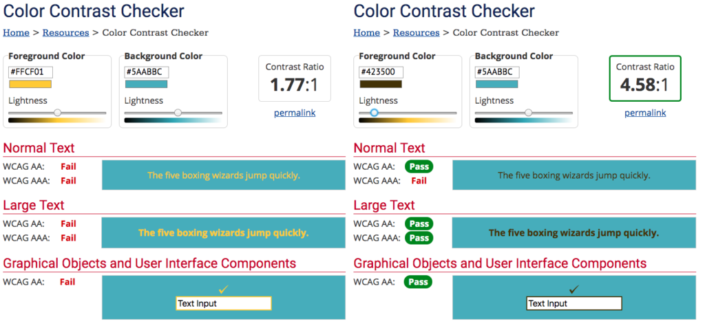
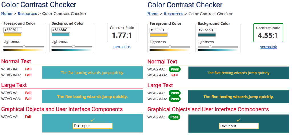
Here are two examples, side by side, the left fails, while the right passes. In each, I chose two of the brand colors for Notre Dame* and then dragged the foreground and background colors darker until they reached the appropriate contrast ratio.

Color Contrast checker showing a failing and then passing grade on text on a solid backgroundColor Contrast checker showing a failing and then passing grade on text on a solid background


If you are not color deficient or low vision, you might not have a problem seeing the graphic that fails the test, but we have to remember that we don’t want to exclude the 4.5% of the total population that deals with color contrast deficiencies.

And it’s also important to look at color contrast when you’re using text on top of an image as there may be portions of the image where the text is not contrasted enough or blends into the background.

We probably run into this problem more often than not on Stories as they’re often created on the go or without the benefit of sitting down and being able to test the color contrast. Fixing this can be as simple as adding a background color to the text box, but that doesn’t always work with the aesthetic you’re seeking. This is where an Instagram “hack” comes in handy – if you’d like to add a transparent colored overlay on top of an image you’ve taken in a Story, choose the pen tool, then the highlighter (second pen option) and choose a color then hold down on the screen for a few seconds. Ta-da! Now you can type text with a static color to contrast. Even adding a very light gray transparent background on top of an image that is barely noticeable can help exponentially with color contrast.

*This is a good reminder to check the color contrast even if colors are part of your brand standards (the two I chose are part of our secondary and tertiary colors) as they might not have been intended to use in this particular combination
Social Media Accessibility: Alt Text and Closed Captioning

The Internet is a very visual place, especially when it comes to social media. We’re constantly sharing tweets, posts, videos and beautifully designed websites across every platform. We work hard to pair images with appropriate text in a compelling way to share Notre Dame and our stories with the world.

But up until very recently the platforms where we tell these stories have left a portion of the populations out by being inaccessible to users who are hearing or visually impaired.

That’s changing, though, as Instagram rolled out a straight forward option to add Alt Text for those using the platform with screen readers in late 2018. Facebook and Twitter also have the option to add Alt Text to images but you have to dig a little deeper to find it.

And while the option to add Closed Captioning or Subtitles to YouTube, Facebook and Twitter videos isn’t new, it’s just as important to help make all our visual content accessible to those who may be hearing impaired. (Not to mention the 85% of social media users who watch videos with the sound off.)

Here’s how to make our content accessible to the hearing and visually impaired: Continue reading Social Media Accessibility: Alt Text and Closed Captioning

5 Tips to Combat Falling Reach after Facebook’s News Feed Change

Two weeks ago, Facebook announced a major change to their News Feed which they titled “Closer Together.” It’s been talked about substantially by many major media outlets – who will be greatly affected by the change – and others across industries that use social media (including me last week), but what is it really going to mean for those of us here at Notre Dame?

In last week’s blog post, I discussed that we now have a hierarchy of engagements defined by Facebook’s News Feed Chief Andrew Mosseri:

Likes < Reactions < Comments < Long Comments

While it was always crucial for brands and publishers to post engaging content to reach more people, it is even more important now as Facebook has spelled out that brands and publisher pages will see their reach, video watch time and referral traffic to websites decrease; many predict these metrics will decrease dramatically.

In 2017, the University of Notre Dame Facebook Page posted 298 times and reached an average of 53,500+ people on each of those posts. This was a 38% increase in average reach over 2016 when we posted 294 times and reached an average of 38,600+ people on each post.

That 2017 number increased so considerably because our organic reach evened out considerably. In 2016 our highs were very high and our lows were very low — 51 of our posts did not reach 10,000 people. In 2017, there were only 10 posts that did not reach 10,000 people or more.

I attribute that growth and sustained reach to the fact that we always posted with intention – never posting just to post – and we had great success with links to our Strategic Content features and videos on the site.

In 2018, I can already tell you that we’ll be closer to that 2016 number for posts that reach less than 10,000 people if we don’t exceed it.

Last week, I posted two news stories that failed to meet that threshold – one was an invitation to the January 22 MLK Celebration Luncheon featuring David and Corey Robinson and the other a link to the 2018 Driehaus Prize Laureate announcement. Both of these items would have reached about 20,000 people, if not more, in the News Feed of 2017, but because they collectively received 351 likes, 11 shares and 7 comments (most of which were “Congrats!” or “Wonderful!”). In other words, because the posts did not engage others as much as Facebook requires, Facebook didn’t show the posts to as many people.

On the other hand, our post on the more than 1,000 students, faculty and staff traveling to Washington, D.C. for the March for Life reached a handful more people than a similar post last year even though this year’s post was much more engaging with 5,000 people commenting, reacting or sharing versus last year’s 3,000.
Engagement matters. That’s the name of the game here.

So how do we write posts that engage our audience? It’s going to be very difficult, especially if you’re trying to primarily reach a student audience (for all the reasons described last week) and if your content is primarily news- or event-based.

We’re going to have to become better storytellers and explore the “Why?” of a piece of content. Why does this matter to my audience?

We’re going to have to move beyond headlines and share the meat of a story while still keeping in mind how a post will appear in someone’s newsfeed. Here are some strategies that we’re going to try to be more engaging:

Get to the point faster

Facebook inserts a line break after 7 lines of text or about 220 characters. The majority of people will not click to read more. Put links and calls to action before this point.

Post longer videos

Long videos perform better than short videos even after the algorithm change. If you’re sharing something with a video attached make sure the video is longer than 30 seconds or you’re already hampering the post. Make sure the you’re making your video as accessible as possible, too:

  • Make sure the video begins in the action, too. You have to capture someone’s attention immediately, so leave brand marks for the end of a video
  • Create your video to be consumed silently, too. Either include closed captioning or create a video with text on the screen as most people will not click to turn the sound on.

Post more frequently

This is not something I ever thought I would say as I treat the University’s Facebook page as the equivalent of nd.edu – we don’t post multiple new things on nd.edu every single day so we didn’t post that many on Facebook either. With this new algorithm, however, it seems like posts have a shorter shelf life. Posts used to reach people throughout a 24-hour period and then much slower after that. I’ve noticed that on posts since the News Feed change, our reach has considerably slowed within the first 12 hours. Consistency will be key to see if posting more frequently will reach more people, or reach that same small number of people.

Use Live video very sparingly

Facebook has already said that Live Video will perform better than pre-produced video in the News Feed environment, so we should all switch to going live, right? Wrong. Live Video should only be done sparingly and for events that it makes sense for. Because many people get a notification when your page goes live you’re interrupting their day and you better make it worth their while.

Consider consolidating pages

This could be the most controversial of all the things I say about the new News Feed because we all like to feel an ownership of our audiences and our content. Facebook has told us that groups will feel this News Feed crunch less than pages, and Facebook pages now have an option for sub-groups. If, in a few months, campus partners are still seeing severely decreased reach it may make sense to begin a conversation of consolidating centers and institutes under an umbrella heading with subgroups for each constituency under that page. So far there are no plans to do this on campus, but the option is still there as having more units contributing to one page could help with consistency and engagement.

Facebook “Closer Together”: What does it mean for Notre Dame?

Golden Dome at Night

On January 11, Mark Zuckerberg took to his own Facebook account to announce a major change to Facebook’s News Feed, now called “Closer Together” by the company, with the intention to make sure “the time we all spend on Facebook is time well spent.”

For Zuckerberg and Facebook, that means they want to increase the amount of content you’ll see from your friends, family and groups in your News Feed and they’re going to decrease the amount of content you see from businesses, brands and media on the platform.

While all of this sounds like it could cut down on the amount of fake news, clickbait and overall dumb posts that we all see on Facebook it will also cut down on the reach of all of our posts from pages across the University.

This isn’t the first time that Facebook has tweaked its algorithm and we’ve always managed to respond with a shift in the way we deliver content. In the past three years, we’ve worked hard to build an engaged community by delivering very strong, well-designed written content in links to articles from Strategic Content, pivoting to compelling video that can help us tell our story (like introducing Fr. Greg Boyle as the 2017 Laetare Medal recipient), and posting on a consistent schedule with a consistent tone of voice on the University’s page – but this time feels different.

Organic reach on Facebook has been declining since 2011 with a more rapid decline happening since March 2014. Many of the 65 million pages on Facebook currently average 1 to 2 percent organic reach. Many pages in higher education and publishing saw double digit declines in average organic reach in 2017.

But this is the first time that Facebook has been so open about what their plans are for brands and publishers on the platform. While in the past the company has announced algorithm tweaks that they claim will focus on friends and family, or that they will diminish the reach of posts that utilize click baiting (“Top Ten lists. You’ll never BELIEVE what number 7 is” May 2017) or engagement baiting (“Tag a friend who needs this!” December 2017) tactics. But this is the first time that Mark Zuckerberg has posted to explain a fundamental shift in Facebook’s future direction. He has said that he expects people will spend less time on the site and he is OK with that as it will be better serving the original goal of Facebook – to connect friends and family – and people will no longer be passively consuming videos or information.

While it’s always been true that Facebook’s algorithm rewards content that people engage with, it will be even more important now – and the types of engagement now has a defined hierarchy:

Likes < Reactions < Comments < Long Comments

Anything that takes longer to do on a phone (56% of Facebook users ONLY log-in on a mobile device) is weighted more heavily than things that are simple. Liking is easy, but hovering over the like button and choosing “Love,” “Haha,” “Angry” or “Sad” is harder. Saying “Congrats!” is easy, but saying something in depth and beginning a conversation is harder. Facebook will be showing those posts that provoke a reaction or in-depth comment more than it will show posts that are just liked.

So what does this mean for those of us here at Notre Dame?

The jury is still out as Facebook is rolling these changes out over the next few weeks, but it looks like it will have far reaching consequences for Facebook pages on campus especially for those accounts who are primarily trying to reach students there.

We know that students (still) use Facebook but they are primarily passive users. They check in with friends and family, follow brands and pages that they find value in, and occasionally post photos to let their parents and extended family see what they are up to. They do not often actively engage with pages or brands – they don’t comment, they don’t like and they don’t share. And more importantly, they won’t be changing their engagement behavior on Facebook, no matter how much we’d like them to so that our content will be served to as many people as possible.

That means that we’re going to either need to find out new ways to present our content on Facebook to entice them to engage (something I’ll be talking about in a subsequent blog post) or we’re going to need to discuss new ways to try to reach students either on a different social platform, by consolidating individual Facebook pages into broader focused pages or by shifting to groups under one broader focused Facebook Page umbrella.

I can tell you that the University of Notre Dame Facebook page is already seeing the effects of this News Feed change and has been for a few months. We’re primarily experiencing a decline in the reach and views of static videos. Andrew Mosseri, Facebook’s News Feed chief, has blatantly said that this is a direct result of Facebook’s desire to deliver the most engaging content to users instead of passive experiences.

“Video by nature is very passive,” Mosseri said in an interview with Wired Magazine. “So while you’re watching a video on Facebook you don’t tend to comment a lot, like a lot, or talk with your friends a lot, or read articles for that matter.”

I’ll continue to blog about our experiences with Facebook as these news feed changes take hold in the market. Check in for a blog post on what we can do to promote engagement and try to combat this decline in organic reach soon.