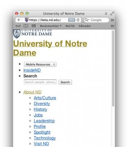
 We will be building ND.edu in what is known as “mobile first.” That means that the initial styles and layout are going to be formatted for small screens first; then we’ll be adding functionality and layout for larger devices (tablets, laptops, etc.) as we progressively add more and more features. We do this to provide our mobile users the best experience possible while assuring full access to all content.
What this means to you, the reader, is that if you’re checking out the beta site fairly early in the process and it looks odd to you, you will need to try scaling down the width of your browser. Then look at the content as a small-screen device will render it. Well, that or just look at the site on your mobile phone.
As we get closer to launch, you will start seeing what you would consider a “normal looking site” start to take shape.