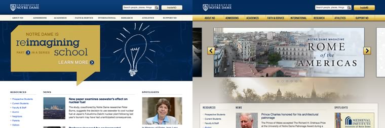
As part of our ongoing efforts to provide the best possible Notre Dame Web experience, we updated ND.edu with new styles and an interactive feature area on February 7. Over the past six months, we’ve used the feature area to spotlight a series of five “In Depth” stories for approximately a month each. While we’ve found success in this approach, we decided to modify the homepage to allow our visitors easy access to these stories and, at the same time, allow us to feature what we feel is exceptional content that exists outside of the main ND.edu site.
 We hope you enjoy the change. Don’t get too attached, though.
We’re already well into a full redesign of the site that will take place over the next several months. If you want to be an active viewer of the changes as they happen, keep an eye on beta.nd.edu.
Not a fan of the new font and yellow nab bar. Go back to serif and ignore the consultant’s cry for keeping serif fonts on paper only.
Good thing I don’t have to get too attached.
I agree. Cheap looking.
The story spotlight isn’t so bad but can’t you make it take up the whole width like the in depth stories did?
Change it back! I think you had a lovely design and agree with the commenter above about the yellow. I liked the white and blue before!!!
Mary, I totally agree with you
I like the story navigation. It reminds me of the old blue one. But those who say the yellow isn’t as nice looking I have to agree with.
Hey what is up with this new site? You guys did a great job on the last one – I like some of the changes, mostly the bottom half. Why did you make the top more “grungy?” It seems too unprofessional to be the Notre Dame I love.