Whether you’re a fan or not, whether you’ve even seen it or not, you’ve probably heard of the PBS show “Downton Abbey”. When something’s parodied by Jimmy Fallon and ‘The Simpsons’ you know it’s a pop culture phenomenon.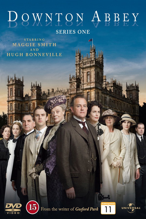
In early April I received an email from Melanie Webb, event coordinator for the Nanovic Institute for European Studies. They wanted to give a special gift to their outgoing interim director, Don Crafton. They’d come up with the idea to do their own interpretation of “Downton Abbey.” Since the Nanovic Institute is housed in Brownson Hall, the name conveniently worked as “Brownson Abbey”.
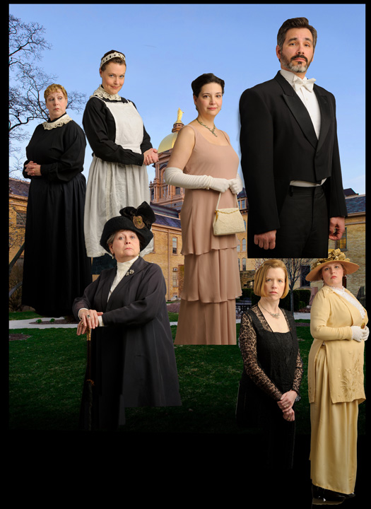
After looking closely at the “Downton Abbey” promo image I was confident it was done as separate photos combined after the fact. The lighting was big, soft, and consistent (whew!) and I realized we could utilize our department’s studio in the basement of Grace Hall. The Nanovic staff was all-in on the concept and arranged to borrow early 1900’s period clothing for the shoot.
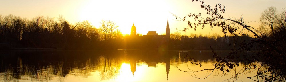
We shot the individual portraits in an afternoon in our studio. The Nanovic staff had blocked out where each staff person would stand, what direction they would face, and what character or persona each would try to portray. I photographed everyone on a plain white background with the idea that they would be cut out using Photoshop. The basic photography was quite simple, the real work was trying to get the best expression from each of our ‘cast.’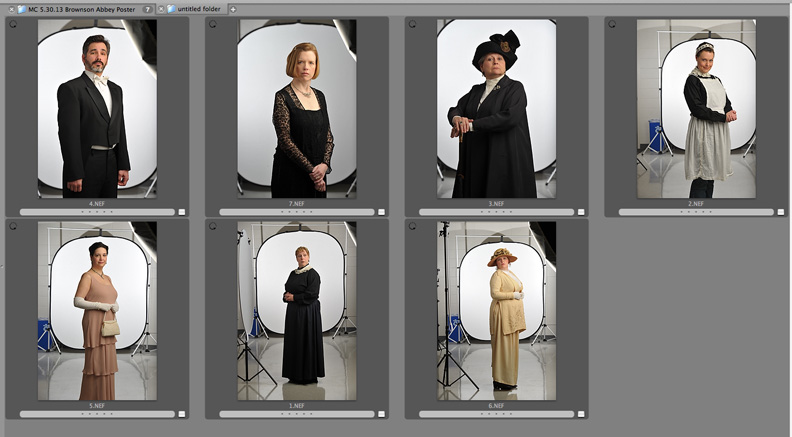 I made a quick trip over to Brownson Hall on an evening where the sky was clear and the courtyard was lit with a nice warm light. Conveniently, the Main Building is visible over the top of Brownson Hall, echoing a bit the tower of Highclere Castle, the actual building used as the fictional Downton Abbey.
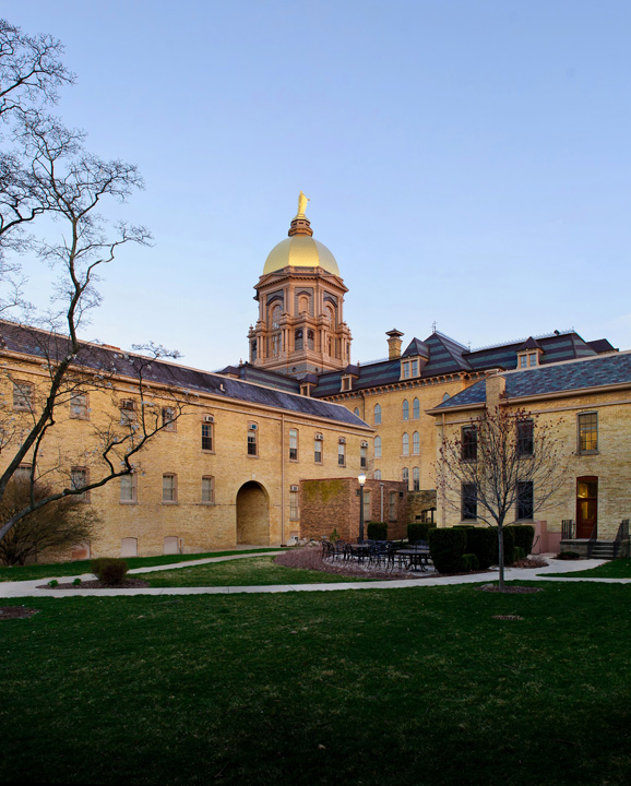
Then the real work began!
Each person needed to be cut out of the studio background and placed onto the image of the Brownson Hall courtyard. If you are familiar with Photoshop, you’ll understand that the Quick Selection Tool is your friend in this situation. Most…of…the…time. After, uh…painstakingly…touching up some of the finer details we had 7 people ready to be placed and sized in our background.
The Nanovic Institute staff came up with the credits and logos at the bottom in the style of a Hollywood movie poster, (They were even kind enough to make me “director of photography.”) and had a few winks with some inside jokes for the pull-quotes from the “critics” at the top.
And finally, voila! The Nanovic assistant directors and coordinators were now lords and ladies.
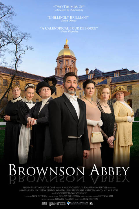
The poster was well-received by all and was a fun project to work on. I don’t normally do compositing in Photoshop so it was a good stretch of my own skills, not to mention a great way to utilize our studio. But the most important element of the project was the enthusiasm of the Nanovic staff. They were willing to take the time and more importantly make the effort to be in character and I think that really comes through in the final result.
Matt Cashore