On April 22 we removed the automatic redirect from nd.edu to our mobile site (m.nd.edu). So how has this affected traffic to the mobile portal? I’m glad you asked. Total traffic to m.nd.edu has essentially decreased by half. This is not a surprising number since it’s likely a lot of redirected traffic simply wanted to get to the “real” homepage anyway. Following are some stats that I find particularly interesting:
The Numbers
- Bounce rate (visitors leaving the site) from the home-screen has decreased by 16%.
- The average time-on-site and pages per visit have increased.
- Return visits have increased by 28%.
- Traffic to the number one visited section (Food) has increased.
These numbers suggest to me that the traffic to the mobile portal consists of more quality traffic from users who intend to go there. Even though we’re not directing mobile users automatically, we still provide quick access to the mobile portal from every page on the primary site. It’s not perfect, in my opinion, but the numbers suggest it’s working.
What’s Next
Removing the redirect is a change we have been considering since we began using responsive design. When we first launched the mobile portal at the end of 2009, the concept of a mobile-specific site made a lot of sense. But now that we have tools such as RWD and RESS and the comfort to work with a mobile-first mindset, redirects suddenly become much less necessary. The problem we’re faced with is that our long-time visitors have come to appreciate, and to some extent, depend on the tools we’ve built into our mobile portals. But that’s where I think we need to change our mobile vs desktop mentality.
Presently the most popular sections on m.nd.edu are Food, Webcams, Athletics, Map and Events. Of these top five, four are available at different urls, be it our main site, or sub-sites. Some of these (such as Map and Webcams) are also very mobile friendly, and the others could, and will, be made mobile friendly soon. Food however, easily the top trafficked section (during the school year), would be useful to non-mobile users as well. If we build all of our sites “right”, which these days means mobile friendly (both in usability and responsiveness), then there’s no reason to keep these mobile portals around.
We need to take what we’ve learned from this exercise and carry it into future iterations of our primary site. We need to give ALL users access to these handy resources that they can access quickly on ANY device and present them with an optimal experience. Case in point, 9 percent of the traffic to the Food section is from non-mobile devices. In the current setup, we don’t provide an easy way for non-mobile devices to access it short of typing in the direct url, or clicking through the About page. That tells me that there are users who really want access to this information on their “not-mobiles”.
In my opinion, it’s time we roll our mobile portals into our primary sites. This can be done initially by skinning our “m dots” and primary sites to share a visual identity. This would require us to re-think the mobile sites a little and re-work their interfaces to be responsive as well, since a lot of the visual elements we’ve adopted come from iOS and Android. Then we work the navigation for the mobile portal into each primary site’s navigation. Over time, we can move the functionality out of the mobile platform and into the same platform as the primary.
I’m not sure yet what we should call this collection of mobile tools. I do know that “mobile” should not be in the name. Tools. Resources. Utilities. I don’t know. We’ll need to do some research to find out what would make sense in the mind of the typical user. What I do know is that we shouldn’t stop creating these simple, easy-to-use features. Users want them. And not just those on mobile devices.
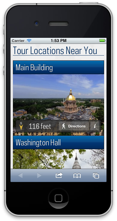
 Something that has bothered us since the beginning of the redesign was the fact that the large feature images displayed on tablet/desktop devices did not have a similar feature for mobiles. We chose not to include it in the mobile experience because the idea of showing large feature images didn’t translate well to the mobile experience. In an attempt to maintain feature parity, we have been working on ways to bring the tour locations as presented on desktops to mobiles, but to do so in a way that lends itself to the strengths of mobile devices.