by Luke Kelly, Gladys Brooks Conservation Fellow, Hesburgh Libraries
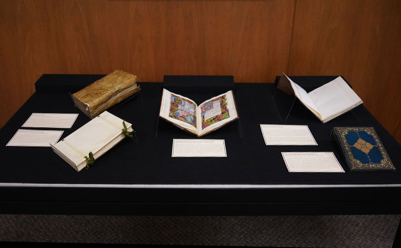
The books in Special Collections’s April-May spotlight exhibit represent a small selection of materials from the University of Notre Dame’s collection that reveal the influence of William Morris on the Arts & Crafts movement. From the printing and binding of Thomas J. Cobden-Sanderson to the illumination and calligraphy of Edward Johnston and Alberto Sangorski, Morris’s ideal of the “book beautiful” was taken up by dozens of other makers who sought in their own way to merge artistry and craftsmanship in the creation of beautiful books.
William Morris founded the Kelmscott Press in 1891 in response to the decorative excesses of the waning Victorian era and declining material and design standards in book publishing. He aimed to print books “which would have a definite claim to beauty, while at the same time they should be easy to read and should not dazzle the eye, or trouble the intellect of the reader by eccentricity of form in the letters.” 1 Perhaps for the first time in Europe since Gutenberg, Morris sought to design the whole book, selecting the paper, type, illustrations, typography, binding, and even the ink that were used in the production of books from the Kelmscott Press.
In making these decisions, Morris was informed by a set of exemplary medieval manuscripts and early printed works that he assembled as a personal reference library. On his historical influences in book design, Morris wrote “I have always been a great admirer of the calligraphy of the Middle Ages, & of the earlier printing which took its place. As to the fifteenth century books, I had noticed that they were always beautiful by force of the mere typography, even without the added ornament, with which many of them are so lavishly supplied.” 2 The University of Notre Dame is fortunate to have two medieval manuscripts (cod. Lat. c. 6 and cod. Lat. e. 4) owned by William Morris.
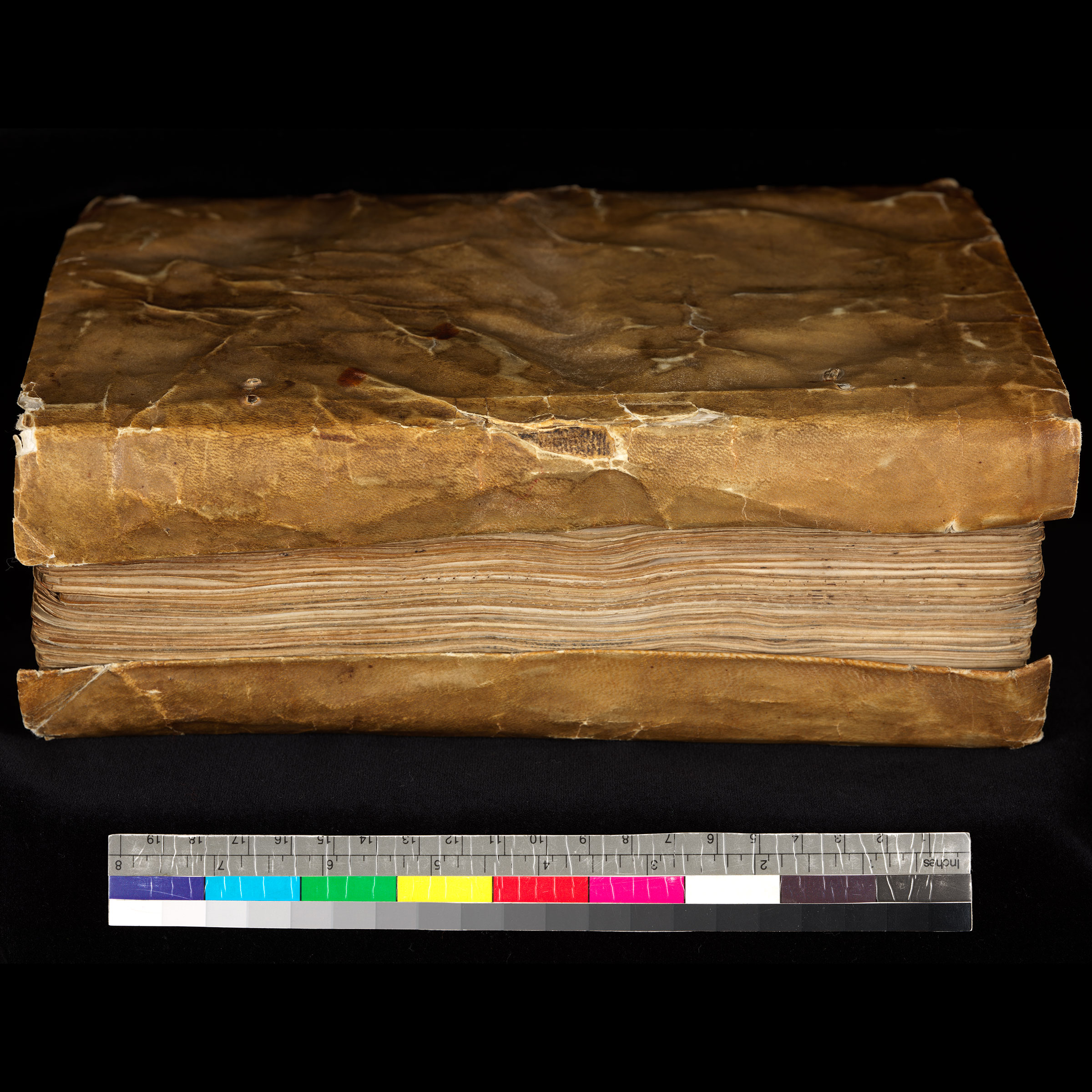

Cod. Lat. c. 6 is a 13th century copy of Peter Riga’s Aurora. Its undecorated, utilitarian limp parchment binding is charming even in its worn state and exemplifies the authenticity that Morris was attracted to in scribal book production. This book features particularly pronounced “yapped” fore-edge folds on the parchment cover, which were intended to protect the page edges from wear. Yapped edges are commonly found in this style of binding, and Morris would go on to incorporate them in his binding designs for books from the Kelmscott Press.
Except for the Kelmscott Press edition of Chaucer’s works, most books from the press were issued in two possible binding configurations: limp vellum with colored silk ties or a hardcover binding with off-white linen covering the spine and blue paper covering the boards. The Earthly Paradise was one of the last publications by the Kelmscott Press, and this particular copy retains its William Morris-designed limp vellum binding with green silk ties. It was bound for the Kelmscott Press by J. & J. Leighton. The yapped fore-edge folds of this binding are reminiscent of the yapped edges on the Riga Aurora manuscript, though they are more diminutive. The use of green silk (custom dyed at the request of Morris and used for the fore-edge ties on this binding) appears frequently in British Arts & Crafts movement books. A similarly colored green silk was used to sew the copy of Men & Women by the Doves Press in the exhibit and is visible in the gutter fold.
After taking up bookbinding in 1883 at the suggestion of Jane Morris, William Morris’ wife, Thomas J. Cobden-Sanderson established a new aesthetic for gold tooling in bookbinding using repeating patterns of a custom-designed set of brass finishing tools and high quality leather. Cobden-Sanderson’s aesthetic was also disseminated through his teaching. His students, such as Douglas Cockerell and Katharine Adams, became leading binders in their own right. Like William Morris, Cobden-Sanderson was interested in the design of the whole book and believed that ideally each part of the book’s production–materials, typography, illustration, and binding–should function together harmoniously to communicate the ideas contained by the written word.
Though foremost a bookbinder, Cobden-Sanderson collaborated with Emery Walker—a renowned typographer who assisted Morris in the development of several Kelmscott typefaces—to establish the Dove Press in 1900 four years after the death of William Morris. Their Doves typeface was a more accurate, svelte interpretation of Nicolas Jenson’s roman types from the late 15th century than was Kelmscott’s squat Golden typeface used in The Earthly Paradise (and in Morris’s bookplate).
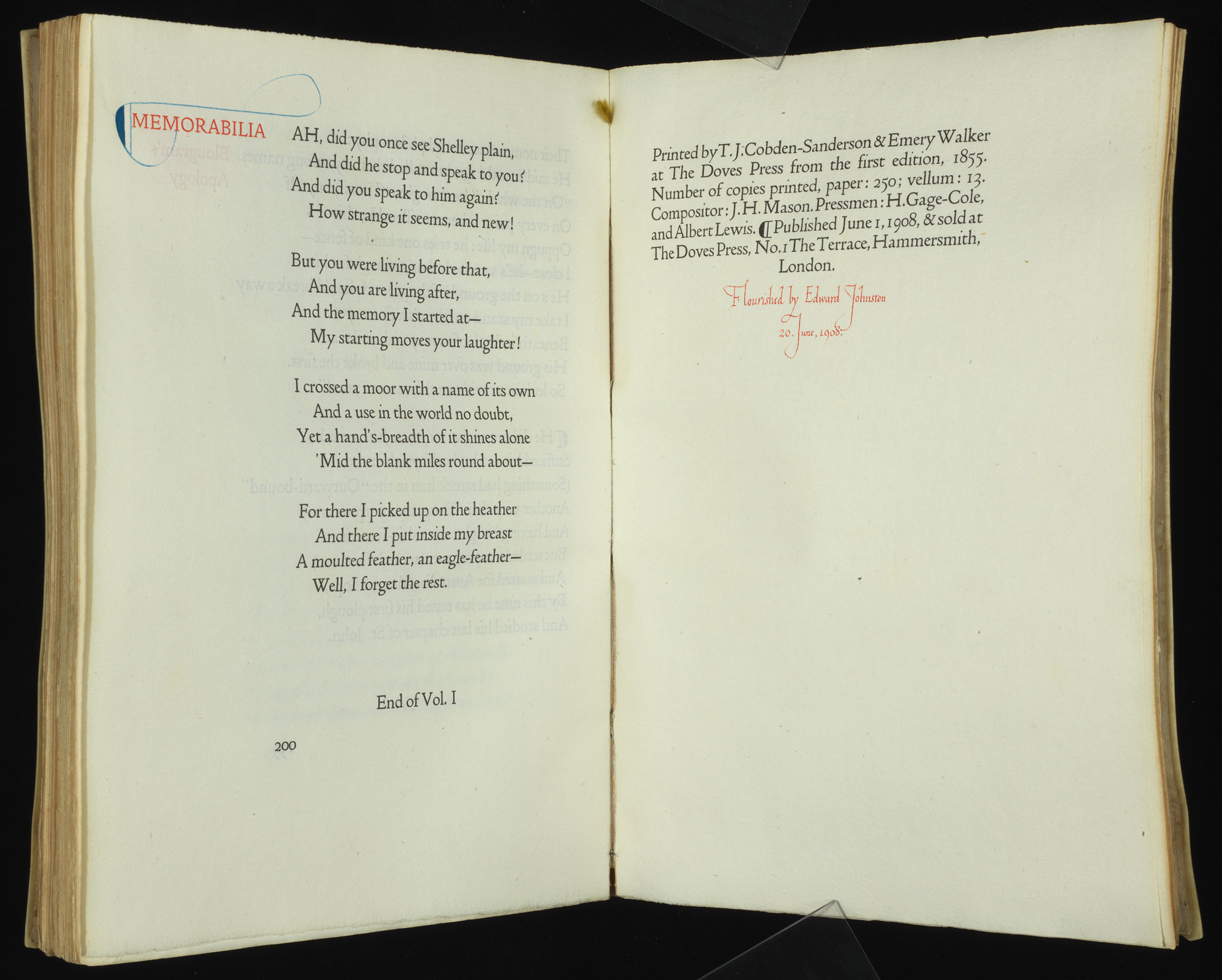
This Doves Press copy of Men & Women by Robert Browning was “flourished” in the margins by Edward Johnston. Johnston was a calligrapher who was inspired by Medieval and Renaissance manuscripts and helped revitalize illumination and lettering in the Arts & Crafts movement. Ironically, Johnston is perhaps best known today for creating the sans serif typeface used by the London Underground transportation system than for his floral calligraphy.
Sometime between 1901 and 1905, Edward Johnston taught calligraphy at the Central School in London to Francis Sangorski, an virtuosic bookbinder and younger brother of Alberto Sangorski. Though Alberto was initially a bookkeeper from Francis’s bindery, Sangorski & Sutcliffe, Alberto learned the rudiments of calligraphy, quill pen cutting, and gold illumination from Francis. In 1905 at the age of 43 (coincidentally the same age Thomas J. Cobden-Sanderson gave up lawyering for bookbinding) Alberto Sangorski established himself as a calligrapher.3
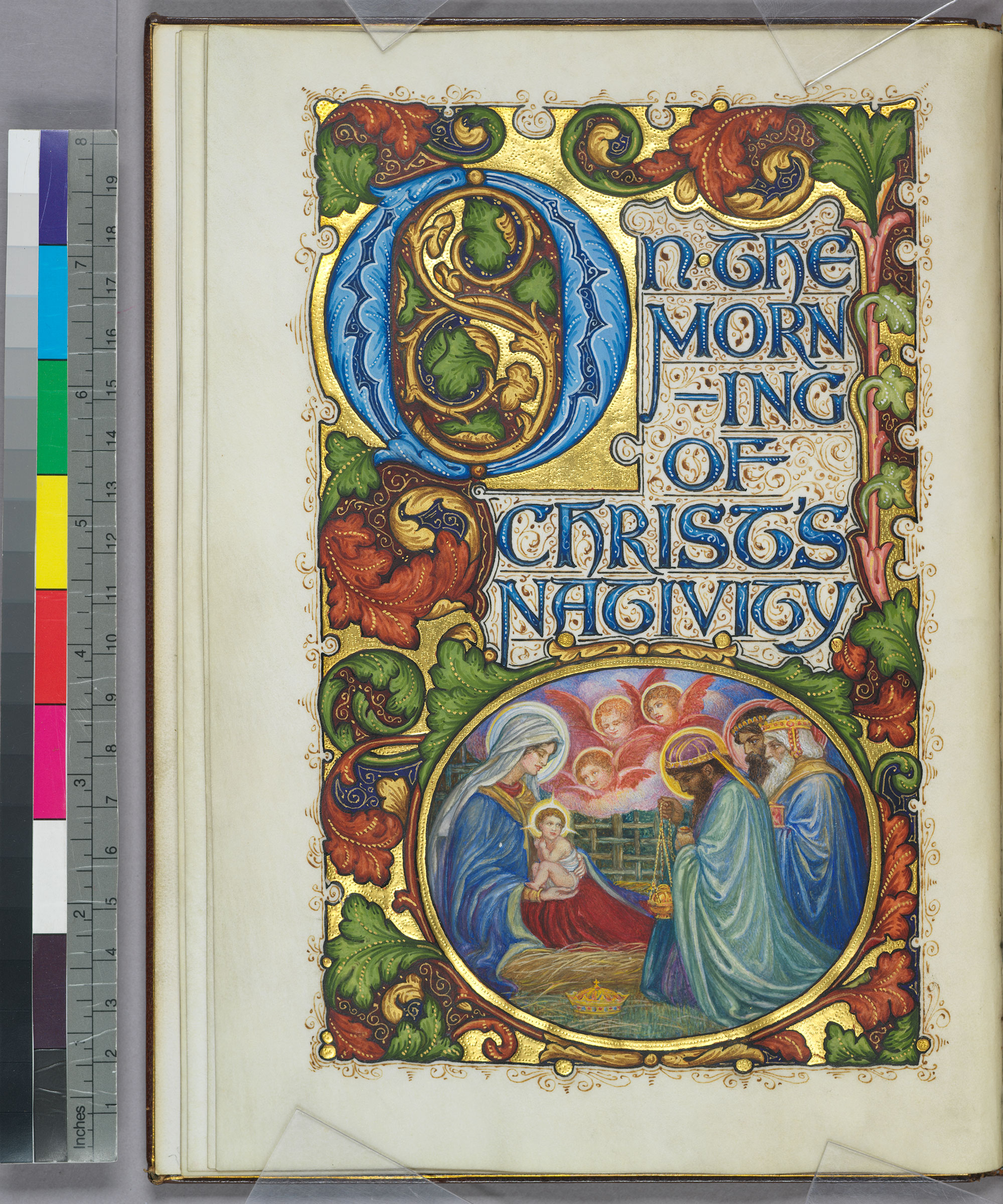
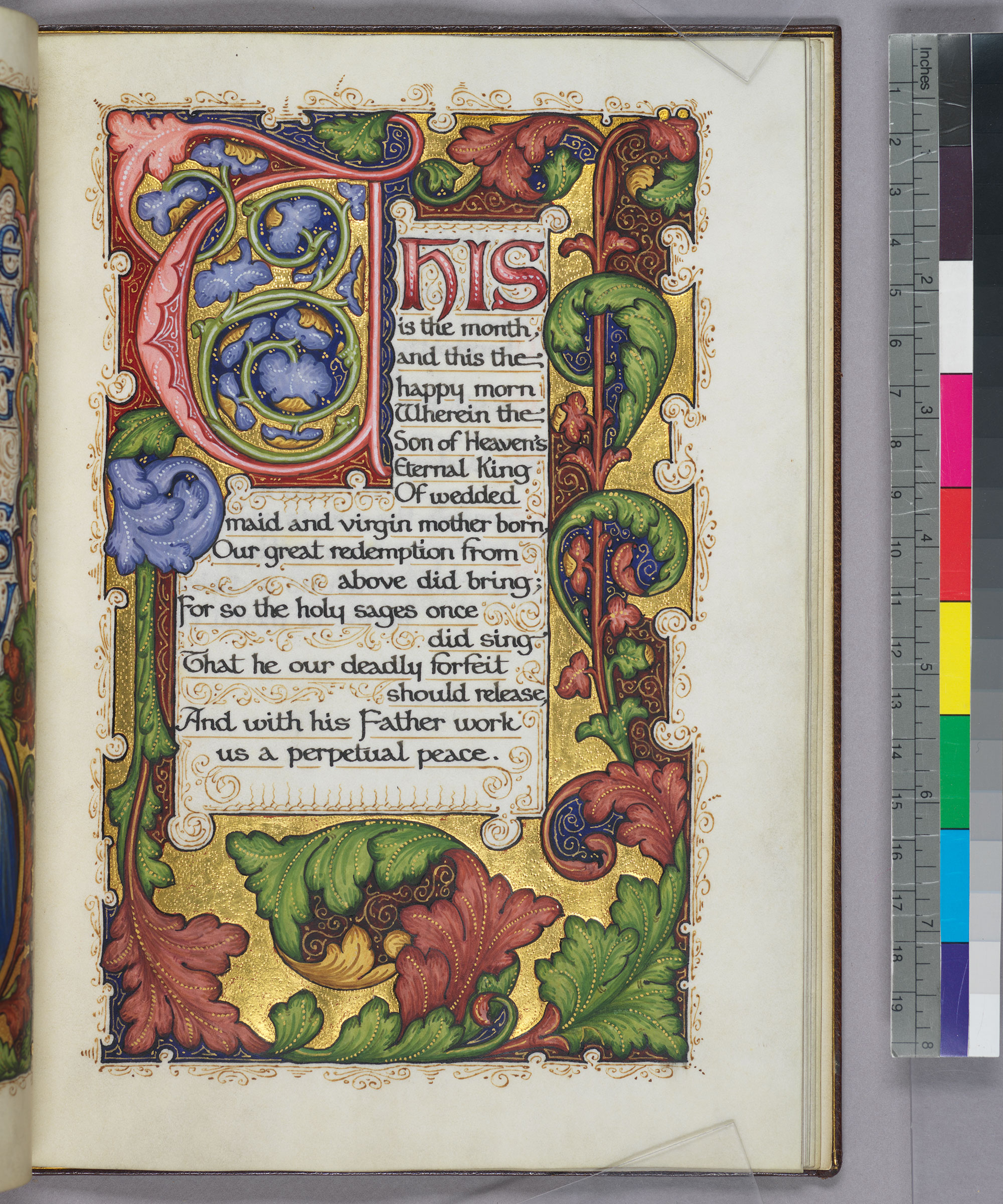
This illuminated manuscript of John Milton’s On the morning of Christ’s nativity: an Ode was created by Alberto Sangorski sometime between 1905 and 1910. Alborto Sangorski developed his own miniaturist painting style based on Medieval and Pre-Raphaelite artists, which can been seen in this manuscript and in the manuscript of Dante Gabriel Rosetti’s The Blessed Damozel also on display in the exhibit. Alberto’s work drifted from the historical modeling of other Arts & Crafts figures and embraced the Edwardian era’s exuberance in design and catered to the conspicuous consumption of the truly “Gilded Age.”
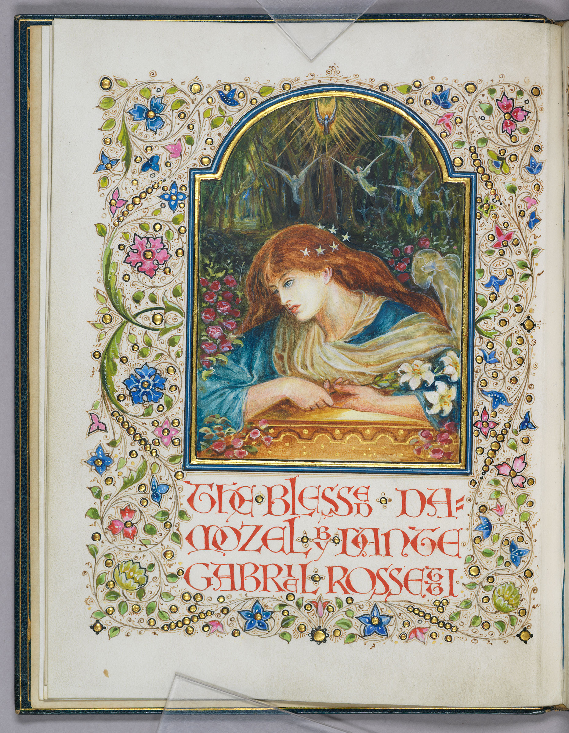
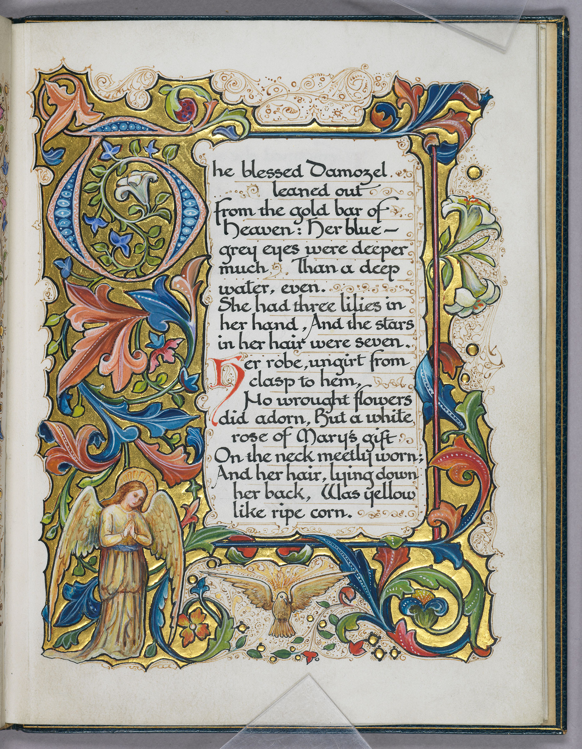
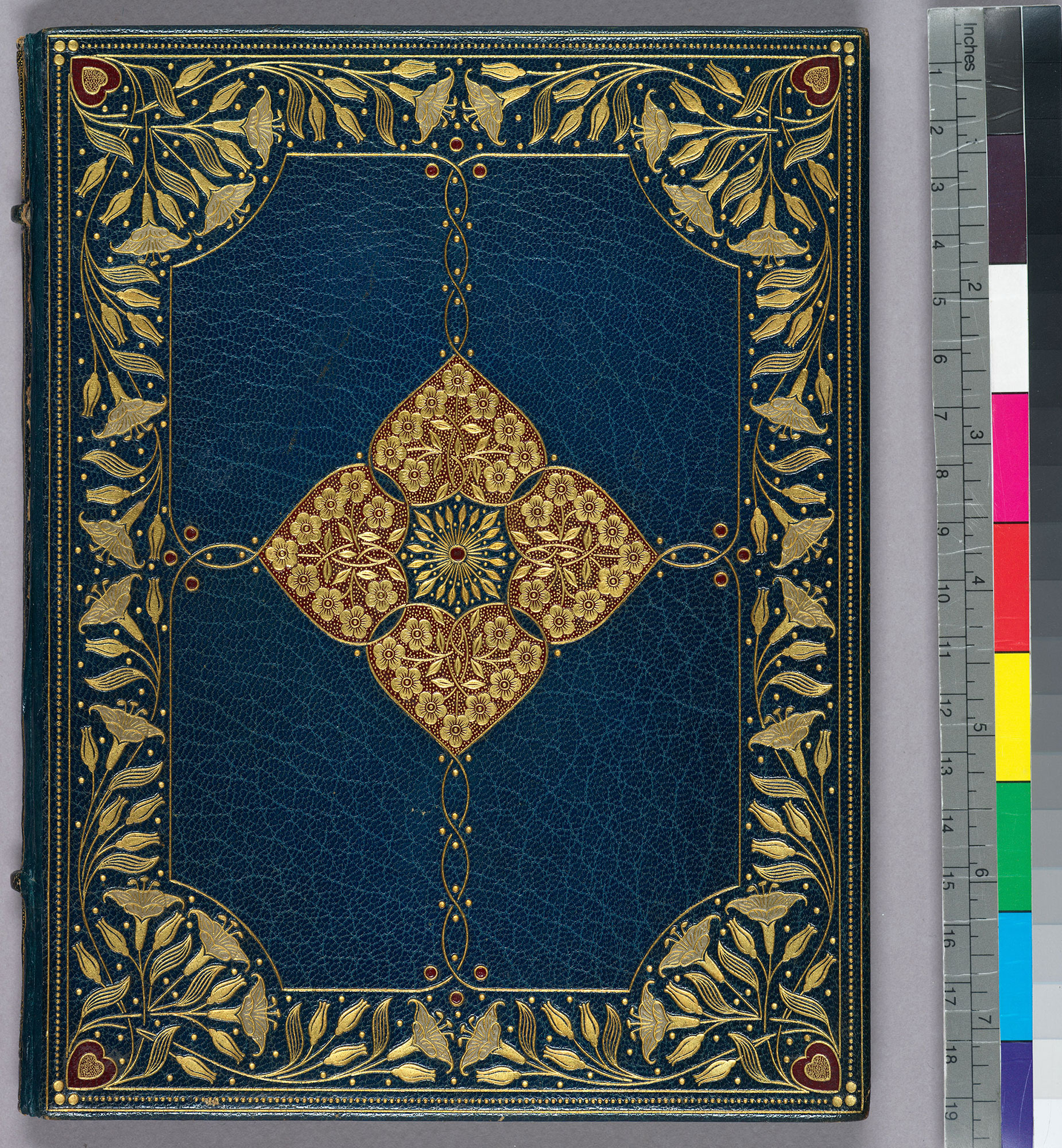
This Alberto Sangorski manuscript of Dante Gabriel Rosetti’s poem The Blessed Damozel was bound by his brother Francis’s bindery, Sangorski & Sutcliffe. Francis Sangorski began his bookbinding apprenticeship in 1901 under Douglas Cockerell, another leading figure in the Arts & Crafts movement who himself trained under Thomas J. Cobden-Sanderson at the Doves Bindery. This binding is typical of Sangorski & Sutcliffe’s higher-end design bindings, featuring elaborate gold tooling and decorative leather onlays of thinly skived crimson goatskin. Sangorski & Sutcliffe’s most expensive and celebrated binding of an 1884 imprint of the Rubáiyát of Omar Khayyám sank on the RMS Titanic on April 14, 1912. Francis Sangorski drowned six weeks later while swimming in the English Channel. Like the Milton manuscript, this codex was likely created early in Alberto Sangorski’s career sometime between 1905 and 1910.
Footnotes
1. Morris 1.
2. Ibid.
3. The Cinderella of the arts 41.
Bibliography
Morris, William. A note by William Morris on his aims in founding the Kelmscott Press. Hammersmith: Kelmscott Press, 1898.
Shepherd, Rob. The Cinderella of the arts: a short history of Sangorski & Sutcliffe. London & New Castle, DE: Oak Knoll Books, 2015.