Interpreting Impairment in MS. Douce 104 Piers Plowman

Bodleian Library MS. Douce 104, dated 1427 by the scribe, contains the only extant cycle of illustrations in a copy of Piers Plowman. The manuscript contains 72 miniatures, ranging from major characters to allegorical personifications to figures mentioned only in passing in the text of the poem. As Kathleen Scott has noted, illustrators in the fifteenth century generally worked from templates or models of figures used in other texts; because of Douce’s singularity in its extensive illustrations of the poem, we can conclude that the images in the manuscript were inspired not by commonly used models, but by the illustrator’s personal response to the text at hand. Thus, the Douce images offer modern readers a unique opportunity to understand how medieval readers (or at least professional readers, like scribes and illustrators) of Piers Plowman may have interpreted Langland’s famously complex poem–and, for the purposes of this post, the poem’s impaired sinners.

While Langland describes his Seven Deadly Sins as rather grotesquely impaired and occasionally disabled in the C-text, the Douce illustrator largely normalizes physical aberrance in his images of the Sins. When taken together, the descriptions in the poem and their accompanying images encourage an interesting relationship between sin and impairment, namely that while sin indeed results in physical impairment, the impairments are perceptible largely to the sinner him- or herself.

Sloth; William Langland; Piers Plowman, England, 1427; Oxford, Bodleian Library, Douce 104, f. 31r

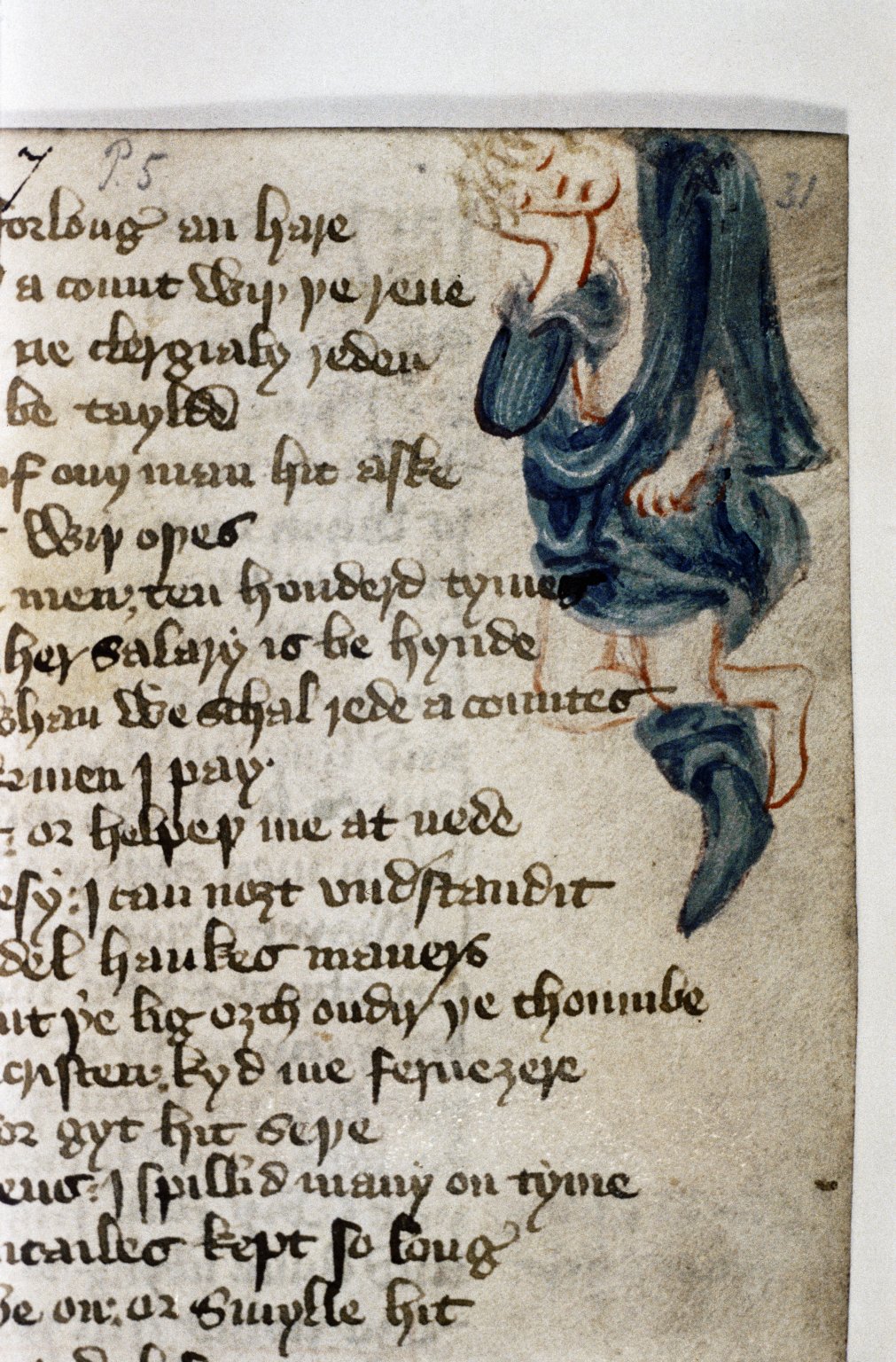
For example, in MS. Douce 104, Sloth is depicted as a young man with rumpled clothing and a boot on only one foot; the other foot remains bare and tucked up behind the booted foot in what could perhaps be a protective gesture (though it’s equally likely that he has just curled up in his sleep). Though Sloth is initially described in the poem as “byslobered with two slimed yes” (C.VII.1), the only concession the illustrator makes to any physical deformity is that single missing shoe, likely indicative of Sloth’s gout, the swelling from which would have prevented him from wearing his boot. What is most interesting here is that the illustrator’s interpretation seems to have normalized Sloth’s appearance from the description presented in the poem, in which Sloth is quite obviously impaired or even deformed.

Envy; William Langland, Piers Plowman, England, 1427; Oxford, Bodleian Library, Douce 104, f. 25r

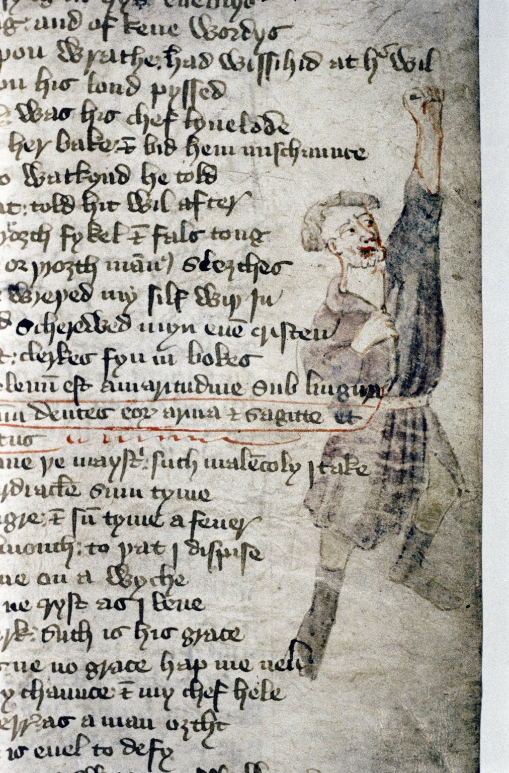
Envy provides another relevant example. In the C-text of Piers Plowman, Envy laments the physical repercussions of his sins: “no sugre ne swete thing [may] aswage my swellynge” (C.VI.88); further, he complains that he has become “so megre for Y ne may me venge” (C.VI.94). In spite of these physical descriptions, the Douce illustrator’s interpretation of Envy is in no way noticeably impaired. Envy appears in folio 25r, an adult man wearing a belted tunic and boots, his left hand raised in a fist (presumably in reference to “A wroth his fuste vppon Wrath”) while his right hand clutches his shirt. In contrast to Langland’s Envy, who describes himself as simultaneously swollen and “megre,” his stature is neither stout nor thin; he actually looks quite healthy and strong. When taken together as they appear in Douce 104, Langland’s written description and the illustrator’s image enable an interpretation of Envy’s physical ailments as discernible only to Envy himself, perhaps indicating that the consequences of sin, though physical, are felt most acutely by the sinner.

There is, of course, much more to say about sin, impairment, and disability in Piers Plowman; for the moment, though, let us revel in both the fascinating glimpse into fifteenth-century reception of the poem and the interpretive possibilities for modern readers provided by the illustrator of MS. Douce 104.

Dana Roders
PhD Candidate
Department of English
Purdue University

Further Reading

Hilmo, Maidie. “Retributive Violence and the Reformist Agenda in the Illustrated Douce 104 MS of Piers Plowman.” Fifteenth-Century Studies 23 (1997): 13-48. Print.

Kerby-Fulton, Kathryn, and Denise L. Despres. Iconography and the Professional Reader: The Politics of Book Production in the Douce Piers Plowman. Minneapolis: University of Minnesota Press, 1999. Print.

Kerby-Fulton, Kathryn, Maidie Hilmo, and Linda Olson. Opening Up Middle English Manuscripts: Literary and Visual Approaches. Ithaca: Cornell University Press, 2012. Print.

Metzler, Irina. Disability in Medieval Europe: Thinking About Physical Impairment During the High Middle Ages, c. 1100-1400. New York: Routledge, 2006.

Scott, Kathleen L. “The Illustrations of Piers Plowman in Bodleian Library MS. Douce 104.” The Yearbook of Langland Studies 4 (1990): 1-86. Print.

The Unfinished Book and Medieval Updating

A website updates, a book doesn’t.

This is one of the many ways to dichotomize two of today’s major competing media. However, such a categorical binary has not always been the case, and in the medieval world books were rarely ‘published’ in the way we’ve come to understand. Take for example the manuscript British Library Harley 1758.

Folio 45
Folio 45v

It was produced sometime between 1450 and 1500 and contains a copy of the Canterbury Tales, including the spurious Tale of Gamelyn. It seems to have been written by three distinct scribes and then corrected by a supervisor of sorts. While finely decorated and illuminated, there are notable gaps throughout the manuscript. Such gaps were clearly intentional at some stage in the process and similar blank spaces can be found in other manuscripts from the Middle Ages. The gaps in Harley 1758 (found on folios 45v, 102, 127 and 200) all fall between the end of one character’s tale and the beginning of another’s. The reason behind such premeditated gaps seems to be an intention to fill them with a portrait of the upcoming speaker. For example, on folio 102, the gap in the manuscript comes between the rubricated sentences Here endith the gode wifes tale of Bathe and Here begynneth the prolog of the ffrere.

Folio 102
Folio 102r

Presumably, then, the plan was to place a portrait of the Friar to fill in this gap. Similarly, on folio 200, we find a gap beginning at the top of the manuscript and ending with the sentence Here begy[n]neth the prolog of the ffrankeleyne.

Folio 200
Folio 200r

In this manuscript, portraits of the Cook, Friar, Manciple, and Franklin, were all clearly intended but have been left out in the process of manufacturing. The modern mind, strongly rooted in the print culture of the last few centuries, immediately wants to call this an ‘incomplete’ manuscript. By the simplistic standards set out above for a book, this work is clearly missing pieces intended for inclusion and therefore cannot be called ‘finished’ or ‘published’ in the sense we think of today. However, in a time with limited writing materials and a high cost of production for a single manuscript, books were an evolving entity and constantly updating in purpose and function. Moreover, as stated above, books like Harley 1758 were the product of numerous workers, all of whom had to be paid. In scenarios such as these, the eventual owners of the book funding its production might have simply run out of money. Even still, the book was ‘published’ despite its missing pieces, and its gaps cleverly used for other purposes in later times.

Folio 127
Folio 127r

Folio 127 of the work has been carefully reused to record the birth dates of the children of Edmund Foxe of Ludford, a 16th century clerk. This type of genealogical information is commonly found in medieval manuscripts, since, as stated above, the preciousness of such items made them valuables in medieval and early modern times.

The gaps in Harley 1758 give us insight into medieval and early modern usage of books and thoughts on the concept of publication. It is clear that the print-age dichotomy of finished and unfinished breaks down for medieval books, and perhaps their status is more akin to modern notions of website updates.

Axton Crolley
PhD Candidate
Medieval Institute
University of Notre Dame

What’s in a Line?: Harley’s Horn and the significance of mise-en-page, Part 1

class noir image
A classic noir image. You know what kind of movie you’re looking at based not on narrative or dialogue, but on the camera angle, lighting effects, costume, and colour — all visual cues of mise-en-scène.

The study of medieval poetics and literature has begun to benefit immensely from the boom in manuscript studies. We’ve seen, even in past entries on this blog, how the layout of a poem in a manuscript can affect the way it is read. It is worth considering as well how the layout of a manuscript page can affect the way we interpret a text even before we begin reading it. In the same way directors signal and elicit particular responses from viewers of film or theatre with mise-en-scène, a scribe attuned to the potential of mise-en-page (also ordinatio) employs different page layouts to ask readers to begin understanding a text in a generic fashion a priori to any close engagement with the text.

A sterling example of the power of mise-en-page is London MS Harley 2253, which offers a smorgasbord of literary treasures from medieval England matched by few manuscripts. A number of scholars have observed how certain choices related to layout point to ways of reading the manuscript. Kerby-Fulton, for instance, observes the speech-markers in Gilote et Johanne, making a text “ready for performance” (54). The mise-en-page in the Harley MS serves as a visual entrée for many of these texts (after all, we are often told that we eat first with our eyes, not our stomachs), asking a reader to consider how they will read before they begin to do so. Because its contents are varied, the manuscript gives us the chance to see how one scribe employed mise-en-page with different types of texts. Of these various genres, languages, and layouts in that manuscript, one text, King Horn, stands as an anomaly of both genre and layout that can go some way in suggesting how layout can influence our reading of a text.

This is not to suggest that the Harley scribe was absolutely consistent, but he was consistent enough to show that his choices in layout were not dictated by whim. For instance, the vast majority of texts with a rhyme scheme of abab or abababcc (with a bob) were written out in a long-line form, with two verses to a line. Poems with an aabb scheme were, with the sole exception of King Horn, written in short lines, usually in two or three columns to a page.

BL Harley MS 2253, fol. 73r, showing at top a two-column aaabcccb poem and at bottom a single column abab poem in long lines.

Tail-rhyme poems of various sorts are also usually written in short lines, with a verse to a line (e.g. 71v-72). Poems with more complex rhyme schemes, such as that on fol. 76 (abababddb) or fol. 63v. (aabaabbaab) are written in a block of text, with virgules separating verses. Prose texts are written out in blocks as one would expect, and such is the case with the Anglo-Norman biblical material following Horn in the manuscript. On the rare occasion where space has apparently become an issue, as on fols. 82v-83 Maximian, the scribe does change layout to suit his needs, switching from a three-column layout to prose form with virgules separating verses at the top of 83r.

Harley Manuscript King Horn

BL Harley MS 2253, fol. 83r, showing at top the final lines of Maximian, written in prose form with verses separated by virgules. Below that is Mayden moder milde, abababab, and finally, King Hornaabb, two verses to a line.

While there is much to say about the various genres and rhyme schemes and their respective mise-en-page, suffice it to say here then that there was a method to the scribe’s ostensible madness. Elizabeth Solopova has given a useful overview of several features of mise-en-page, but she frequently stops short of offering reasons for selecting particular layouts, except to observe the dominance of the rhyming couplet as a guiding principle in line arrangements (e.g. 381). In her assessment, there is much consistency in layout throughout the manuscript. So why does Horn, a poem written in aabb rhyming couplets and the longest text in the manuscript, appear in long lines with two verses to a line, violating the principles of ordinatio that the scribe had been follows elsewhere?

It might seem a trivial question, but it is one that can be explored to give us some sense of how one of the earliest poems of the “romance genre” was thought of by its audiences. Come by next week to read my take on the connection between Horn‘s genre and its layout.

Andrew W. Klein
PhD Candidate
Department of English
University of Notre Dame
aklein3@nd.edu
awklein.com

Works Cited

Kerby-Fulton, Kathryn. Opening Up Middle English Manuscripts (Ithaca: Cornell UP, 2012).

Solopova, Elizabeth. “Layout, Punctuation, and Stanza Patterns in the English Verse” in Studies in the Harley Manuscript, ed. Susanna Fein (Kalamazoo: Medieval Institute Publications, 2000).